Unlocking Success: Crafting an Integrated E-Commerce Marvel with Ewity
Recently, I've been assigned the responsibility of developing an e-commerce application that seamlessly integrates with the renowned POS system, Ewity. The primary objective was to establish a platform enabling customers to browse store inventory and make online purchases. Tackling this task presented its challenges, and I'd like to walk you through my approach and the steps I took to bring this project to fruition. Rest assured, I obtained permission before sharing this post.
In order to optimize the process, I segmented the project into five distinct phases: authentication, inventory listing, order placing, notifying cashiers of placed orders, and generating bills within the POS system without completing the sale. Additionally, I aimed to avoid maintaining separate databases for these processes, relying solely on Ewity's existing infrastructure. This approach minimizes data duplication, reducing the risk of discrepancies and other complications that might arise with it. Without further ado, let's delve into each of these steps individually.
In line with my typical approach, I opted for Vue.js as the primary framework alongside Tailwind CSS for styling. To kickstart the project, I initiated it using the command npm create vite@latest. When prompted, I chose customize with create vue. Although mostly sticking to the default settings, I made a few additional adjustments, such as selecting Vue Router and integrating Pinia for state management. Subsequently, I followed the Tailwind CSS installation instructions outlined in its guide to seamlessly integrate it with Post CSS. These steps are detailed in my latest blog post.
Authentication
You may have gathered that I am an avid supporter of Firebase for authentication. Additionally, a specific requirement for this project was to solely utilize phone-based authentication – and for this purpose, I couldn't find a more suitable option than Firebase. I've already provided a detailed guide with screenshots on how to create a Firebase project on its console here. The only variation is that, instead of employing the email/password provider as described in the previous post, we'll be enabling phone authentication for this project.

Additionally, considering that the free tier of Firebase imposes a limit of 10 SMS messages per day, we'll include a test number for conducting our tests. Here's how you can do it:
- Navigate to the Authentication section by selecting it from the menu on the left-hand side, which will open the Authentication dashboard.
- Click on the "Sign-in method" tab and then enable the Phone provider.
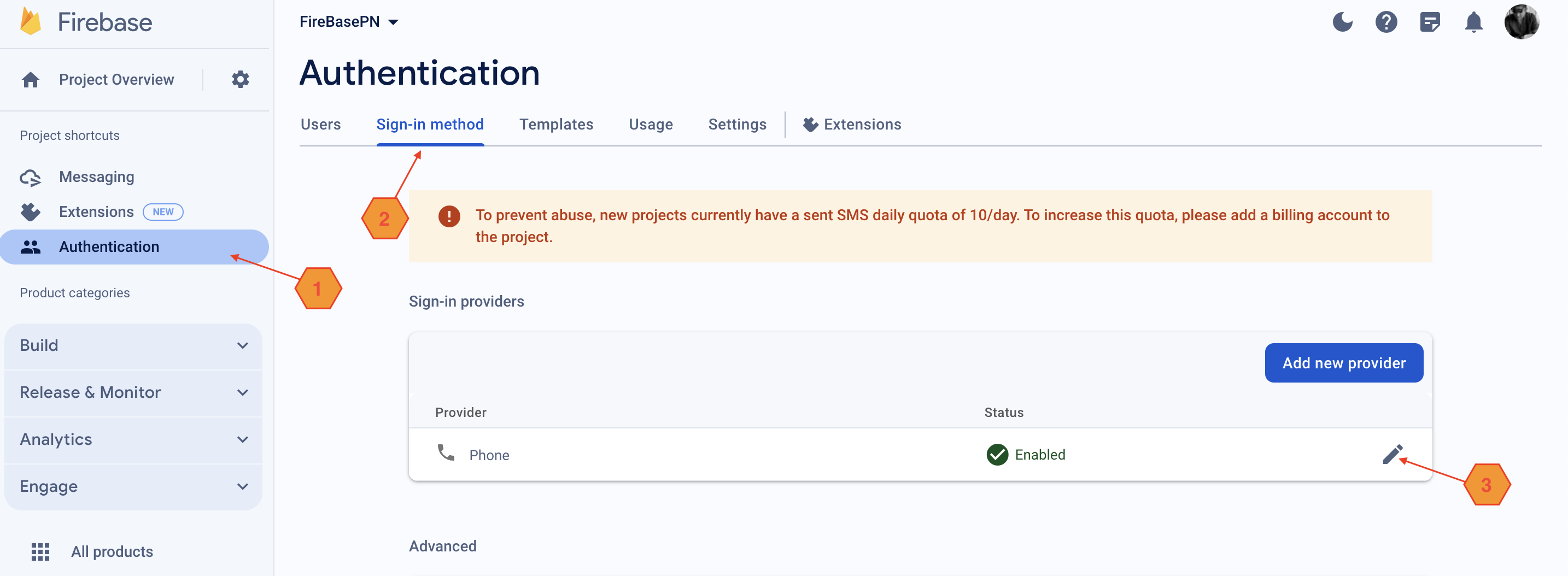
- Scroll down to locate the "Phone numbers for testing" section.
- Click on the "Add Test Phone Number" button.
- Enter the desired phone number along with its corresponding country code. Firebase offers a list of test phone numbers and verification codes specifically for testing purposes.

- Finally, save the changes by clicking "Save".
If you're following along, I'm assuming you've completed the aforementioned steps and have also gathered the Firebase configuration for your web project, as I explained in my previous blog post. To recap, here's a summary of how to collect the configuration:
- Click on the gear icon ⚙️ located next to "Project Overview" in the top-left corner and select "Project settings".
- Scroll down to the "Your apps" section under the "General" tab.
- If you haven't already added a web app, click on the "</>" icon to add one.
- If you've already added a web app, click on the web app's name to view its configuration.
- You'll find a snippet containing your Firebase SDK configuration, typically resembling the following:
var firebaseConfig = {
  apiKey: "YOUR_API_KEY",
  authDomain: "YOUR_AUTH_DOMAIN",
  projectId: "YOUR_PROJECT_ID",
  storageBucket: "YOUR_STORAGE_BUCKET",
  messagingSenderId: "YOUR_MESSAGING_SENDER_ID",
  appId: "YOUR_APP_ID"
};
- Copy this configuration object, we will need it later within the project.
With Firebase set up for our project, we're ready to dive into the Vue project. Let's start by opening the terminal and running npm i to install the project dependencies which Vite created for us. Additionally, we'll install a few more packages that we'll be using:
npm i @headlessui/vue
npm i @heroicons/vue
npm i @tailwindcss/aspect-ratio
npm i @tailwindcss/forms
npm i @vuelidate/core
npm i @vuelidate/validators
npm i @vueuse/core
npm i axios
npm i lodash
For the dialogs, slide overs, and menus used in this project, we'll be utilizing Headless UI. Additionally, I've employed a combination of Hero Icons and Material UI icons for the project. For Material UI icons, we need to add the following reference to the style sheet in the header of the index.html file:
<link rel="stylesheet" href="https://fonts.googleapis.com/css2?family=Material+Symbols+Outlined:opsz,wght,FILL,[email protected],100..700,0..1,-50..200"/>
While we are at adding references in the header of index.html, I'd like to mention that I've also utilized a Google font called Poppins for the project. To do this, the following references to style sheets needs to be included in the header of the index.html:
<link rel="preconnect" href="https://fonts.googleapis.com">
<link rel="preconnect" href="https://fonts.gstatic.com" crossorigin>
<link href="https://fonts.googleapis.com/css2?family=Poppins:ital,wght@0,100;0,200;0,300;0,400;0,500;0,600;1,100;1,300;1,400;1,500&display=swap" rel="stylesheet">
After adding these references, we need to define the font in our tailwindConfig.cjs file. This is achieved by extending the fontFamily as demonstrated below:
/** @type {import('tailwindcss').Config} */
const defaultTheme = require('tailwindcss/defaultTheme')
export default {
  content: [
    "./index.html",
    "./src/**/*.{vue,js}",
  ],
  theme: {
    extend: {
      fontFamily: {
        sans: ['Poppins', ...defaultTheme.fontFamily.sans],
      }
    },
  }
}
We use the Tailwind Forms plugin to customize the appearance of input fields, enabling adjustments in sizes, colors, and border styles. This involved enhancing input presentations for different states like hover, focus, and active, ensuring a consistent appearance across various form components. Furthermore, the Tailwind Aspect Ratio plugin is employed to ensure consistent aspect ratios for images within our category and product grids, regardless of their original dimensions. Once these plugins are installed, it's necessary to include their details in the tailwindConfig.cjs file. Below is how the tailwind configuration file look like after these changes:
/** @type {import('tailwindcss').Config} */
const defaultTheme = require('tailwindcss/defaultTheme')
export default {
  content: [
    "./index.html",
    "./src/**/*.{vue,js}",
  ],
  theme: {
    extend: {
      fontFamily: {
        sans: ['Poppins', ...defaultTheme.fontFamily.sans],
      }
    },
  },
  plugins: [
    require('@tailwindcss/forms'),
    require('@tailwindcss/aspect-ratio')
  ],
}
As you may have observed from my earlier blog post, I rely on Vuelidate for form validation. It simplifies the validation process significantly compared to crafting custom logic for each validation requirement, offering robust functionality that gets the job done efficiently.
Additionally, we will save the cart to local storage until it's submitted to Ewity. This allows users to revisit their cart later, providing the flexibility to leave the application and return at their convenience. To accomplish this, we utilize VueUse Core.
We utilize Axios to communicate with the Ewity API. Furthermore, our application integrates a search/filter functionality, triggering requests to the Ewity API as users input text into the filter dialog's text input box. To mitigate the risk of overwhelming the Ewity API and potentially exceeding rate limits, we leverage Lodash's debounce function. This function ensures that the respective endpoint is only called once a user has finished typing their query.
Upon creating the project with npm, you may have observed that Vite provides us with a rudimentary project structure. Let's proceed by navigating to the src directory within the project and creating a subdirectory named utils. This directory will serve as a central repository for all our external scripts, thereby assisting in maintaining a tidy and well-organized project layout. To begin, within this directory, we'll create a file named firebaseConfig.js to commence the crucial steps for establishing communication between our application and Firebase.
Before advancing further, let's ensure that the Firebase library is installed by executing the following command in the terminal:
npm i firebase
Below is the code for firebaseConfig.js:
// Import necessary functions from the Firebase SDKs
import { initializeApp } from "firebase/app";
import { getAuth } from "firebase/auth";

// Your web app's Firebase configuration
const firebaseConfig = {
  apiKey: "YOUR_API_KEY",
  authDomain: "YOUR_AUTH_DOMAIN",
  projectId: "YOUR_PROJECT_ID",
  storageBucket: "YOUR_STORAGE_BUCKET",
  messagingSenderId: "YOUR_MESSAGING_SENDER_ID",
  appId: "YOUR_APP_ID"
};

// Initialize Firebase
initializeApp(firebaseConfig);
const auth = getAuth();

export { auth };
The objectives of the code in firebaseConfig.js are outlined as follows:
- We started by importing the
initializeAppandgetAuthfunctions from the Firebase SDK. This enables us to streamline the setup and administration of authentication within our application. - Subsequently, we defined a constant named
firebaseConfigto house the essential configuration details indispensable for establishing the connection between our web application and Firebase services. These specifics, comprising the API key, authentication domain, project ID, storage bucket, messaging sender ID, and app ID, were garnered during the creation of the Firebase project. - We proceeded to initialize the Firebase by furnishing the
initializeAppfunction with thefirebaseConfigobject. This pivotal step establishes a seamless connection between our application and Firebase services. - Following initialization, we utilized the
getAuthfunction to obtain an authentication instance. This instance empowers our application to seamlessly interact with Firebase Authentication, thereby facilitating functionalities like user sign-in, and authentication state management. - Lastly, we exported the authentication instance (
auth) from the module, rendering it accessible for utilization across various segments of our project. This accessibility empowers components or modules to execute authentication-related operations effortlessly.
Now let's redirect our attention to our user store, which functions as a Pinia store dedicated to handling user-related states and actions, particularly authentication tasks. To achieve this, head to the stores subdirectory within the src directory and create a file named userStore.js.
Below is the source code for this file:
import { defineStore } from "pinia";
import { signOut, onAuthStateChanged } from "firebase/auth";
import { auth } from "@/utils/firebaseConfig";
import axios from "axios";

export const useUserStore = defineStore("userStore", {
  state: () => ({
    userData: null,
    user: null,
    loadingSession: false,
    apiUrl: import.meta.env.VITE_POS_API_URL,
    axiosConfig: {
      method: 'get',
      maxBodyLength: Infinity,
      url: null,
      headers: {
        'Authorization': import.meta.env.VITE_POS_API_KEY
      }
    }
  }),
  actions: {
    async logoutUser() {
      return new Promise(async (resolve, reject) => {
        try {
          await signOut(auth);
          this.userData = null;
          resolve(true);
        } catch (error) {
          reject(error);
        }
      });
    },
    fetchUserDetails() {
      return new Promise((resolve, reject) => {
        const config = this.axiosConfig;
        config.url = `${this.apiUrl}v1/customers?q_q=${this.userData.phoneNumber}`;
        axios.request(config)
          .then((response) => {
            this.user = response.data.pagination.total > 0 ? response.data.data[0] : null;
            resolve(this.user);
          })
          .catch((error) => {
            reject(error);
          });
      });
    },
    createPOSUser(data) {
      return new Promise((resolve, reject) => {
        const config = this.axiosConfig;
        config.method = 'POST';
        config.url = 'https://cros-proxy.eyaadh.workers.dev/?apiUrl=https://api.ewitypos.com/v1/customers';
        config.data = data;

        axios.request(config)
          .then((response) => {
            this.user = response.data.data;
            resolve(this.user);
          })
          .catch((error) => {
            reject(error);
          });
      });
    },
    currentUser() {
      return new Promise((resolve, reject) => {
        onAuthStateChanged(auth, (user) => {
          if (user) {
            this.userData = user;
          } else {
            this.userData = null;
          }
          resolve(user);
        }, (e) => reject(e));
      });
    },
  }
});
Here's a breakdown of what the code accomplishes:
Imports:
- We import
defineStoremethod from the Pinia library, which aids in store definition. - Functions from the Firebase Authentication SDK (
signOut,onAuthStateChanged) are imported to manage Firebase authentication. - The
axioslibrary is imported for handling HTTP requests with the Ewity API. - From the Firebase configuration file (
firebaseConfig.js), we import theauthobject, enabling interaction with Firebase Authentication.
- We import
Store Definition:
- We define the
useUserStoreconstant using thedefineStorefunction, setting the name of the store as"userStore". - The state of the store includes properties for:
userData,user,loadingSession, andaxiosConfig. These store information about the user, the current session status, and the Axios configuration for HTTP requests.
- We define the
Actions:
logoutUser: This action handles signing the user out and clearing the user data from the store's state.fetchUserDetails: This action initiates an HTTP request to the Ewity API to fetch user details based on the phone number provided during authentication.createPOSUser: This action sends an HTTP POST request to create a new customer in the POS system.currentUser: This action monitors changes in the user's authentication state and updates theuserDataproperty accordingly.
At this stage, it might feel a bit overwhelming and confusing, but hang in there. As we delve deeper into the project, everything will start to fall into place. Let's now direct our attention to configuring our Vue Router. Before we proceed, we'll also create a few empty template files in our views directory that we'll reference within our router:
- HomeView.vue
- CategoryView.vue
- LoginView.vue
- MyCartView.vue
Each of these files represent a view we will have within our project. We'll revisit each of these files shortly. For now, let's focus on completing the setup of our router. To do this, open the index.js file within the router subdirectory located in src, and replace its content with the following:
import { createRouter, createWebHistory } from 'vue-router'
import { useUserStore } from "@/stores/userStore.js";

const requireAuth = async (to, from, next) => {
  const userStore = useUserStore();
  userStore.loadingSession = true;
  const user = await userStore.currentUser();
  if (!user) {
    await next("/login");
  } else {
    await next();
  }
  userStore.loadingSession = false;
};

export const router = createRouter({
  history: createWebHistory(import.meta.env.BASE_URL),
  routes: [
    {
      path: '/',
      name: 'home',
      component: () => import('@/views/HomeView.vue'),
      beforeEnter: requireAuth,
      meta: {
        authenticatedLayout: true,
        requiresAuth: true,
        public: false
      }
    },
    {
      path: '/cat',
      name: 'category',
      component: () => import('@/views/CategoryView.vue'),
      beforeEnter: requireAuth,
      meta: {
        authenticatedLayout: true,
        requiresAuth: true,
        public: false
      }
    },
    {
      path: '/cart',
      name: 'cart',
      component: () => import('@/views/MyCartView.vue'),
      beforeEnter: requireAuth,
      meta: {
        authenticatedLayout: true,
        requiresAuth: true,
        public: false
      }
    },
    {
      path: '/login',
      name: 'login',
      component: () => import('@/views/LoginView.vue'),
      meta: {
        authenticatedLayout: false,
        requiresAuth: false,
        loginLayout: true,
        public: true
      }
    }
  ]
});
Here's what the code does in simpler terms:
- We begin by importing necessary functions from Vue Router and our user store module.
- We've defined a function called
requireAuthto verify if the user is logged in before accessing specific routes of the application. - Afterwards, we create a router instance using
createRouter, specifying the web history mode for navigation between views/routes. - Following that, we define routes for different views such as home, category, cart, and login, each linked to its respective component.
- We've implemented a check using
beforeEnter, which invokes therequireAuthfunction to ensure only authenticated users can access certain routes/views. - Lastly, we've appended additional information to each route, such as whether authentication is required and how it should be displayed in different layouts.
With these updates to the Vue Router, the way the router is imported in our main.js would have been affected. To rectify this, we simply need to replace the existing router import with the following: import { router } from "@/router/index.js". Here's how the main.js file looks after making this change:
import './assets/main.css'

import { createApp } from 'vue'
import { createPinia } from 'pinia'

import App from './App.vue'
import { router } from "@/router/index.js";

const app = createApp(App)

app.use(createPinia())
app.use(router)

app.mount('#app')
Let's proceed with setting up the layouts for the application. We'll maintain two layouts: one for authenticated users and the other for the public who are not authenticated.
- Navigate to the
srcdirectory and create a subdirectory calledlayouts. - Inside the
layoutsdirectory, create two empty templates namedAuthLayout.vueandClientLayout.vue. - Now, open the entry point for the Vue app,
App.vue, and replace its content with the following code:
<template>
  <div>
    <div v-if="route.meta.authenticatedLayout">
      <ClientLayout/>
    </div>
    <div v-if="route.meta.loginLayout">
      <AuthLayout/>
    </div>
  </div>
</template>

<script setup>
import ClientLayout from "@/layouts/ClientLayout.vue";
import AuthLayout from "@/layouts/AuthLayout.vue";
import { useRoute } from "vue-router";

const route = useRoute();
</script>
This setup ensures that the appropriate layout is rendered based on the route's metadata. If the route requires authentication, it renders the ClientLayout. Otherwise, it renders the AuthLayout.
Below is the source code for AuthLayout.vue:
<template>
  <router-view/>
</template>
In this layout template, we opt for simplicity. Rather than adding styles or additional components, we keep it straightforward by directly displaying the view associated with the route. In this project, AuthLayout.vue is exclusively used to display the login page or login view. Styling and components for this view are handled directly within LoginView.vue, as there are no other views sharing its components.
Here's how I envision the login view to function. As previously stated, our requirement is to solely utilize phone authentication. Therefore, the user will be prompted to input their phone number. Our phone authentication provider will validate this number, notifying the user of any issues encountered. If the number is successfully validated, the authentication provider will send a verification code. Only then will we display the input fields for the verification code. Once the user enters the correct verification code, we will redirect them to the next route.

The verification code input in this view presents a slight complexity, as it consists of not a single input box, but rather text boxes for the length of the verification code. This design choice prioritizes aesthetics over functionality, serving as more of a modern touch rather than a necessity for the application's operation or the login procedure itself. We'll create a custom component specifically for this purpose, named OTPInput.vue. You can create this file in the components subdirectory of the src directory. Below is the source code for it:
<template>
  <div ref="container" class="flex gap-4 items-center">
    <input v-for="n in length" :key="n"
           @keyup="(e) => handleEnter(e, n-1)"
           v-model="otpArray[n-1]" type="number" maxlength="1" class="[appearance:textfield] [&::-webkit-outer-spin-button]:appearance-none [&::-webkit-inner-spin-button]:appearance-none block w-full rounded-md border-0 py-1.5 text-gray-900 shadow-sm ring-1 ring-inset ring-gray-300 placeholder:text-gray-400 focus:ring-2 focus:ring-inset focus:ring-neutral-600 sm:text-sm sm:leading-6"/>
  </div>
</template>

<script setup>
import { ref, onMounted } from "vue"

const otpProps = defineProps({
  length: {
    type: Number,
    default: 4
  }
})

const otpArray = ref([])

const container = ref()

const otpEmit = defineEmits(['entered'])

const handleEnter = (e, i) => {
  const children = container.value.children
  const keypressed = e.key


  if (i > 0 && (keypressed === 'Backspace' || keypressed === 'Delete')) {
    otpArray.value[i] = null
    setTimeout(() => {
      children[i - 1].focus()
    }, 100)
  } else {
    const matched = keypressed.match(/^[0-9]$/)
    if (!matched) {
      otpArray.value[i] = null
      return    } else if (i < otpProps.length - 1) {
      setTimeout(() => {
        children[i + 1].focus()
      }, 100)
    }    checkOTP()
  }}

const checkOTP = () => {
  const children = container.value.children

  let flag = true

  for (let i = 0; i < otpProps.length - 1; i++) {
    if (otpArray.value[i] == null) {
      children[i].classList.add('border-red-500')
      flag = false
    } else {
      children[i].classList.remove('border-red-500')
    }  }
  if (flag)
    otpEmit('entered', otpArray.value.join(''))

}

onMounted(() => {
  for (let i = 0; i < otpProps.length; i++) {
    otpArray.value[i] = null
  }
})

</script>
Here's an explanation of the key parts of the above code:
Template Section:
- In the template section, we're setting up a container
<div>with a flex layout . - Within this container, we're dynamically generating input fields using the
v-fordirective, looping through the verification code's length. Each input field corresponds to a single digit of the code. - These input fields are linked to the
otpArrayusingv-model, which keeps track of and stores the user's input for each digit.
- In the template section, we're setting up a container
Script Section:
Import:
- We start by importing essential functions from Vue, such as
refandonMounted, which are used for reactive behavior and lifecycle management.
- We start by importing essential functions from Vue, such as
Reactive Variables:
- This component receives a prop named
length, determining the number of digits in the verification code (defaulting to 4). - Next, we set up reactive references:
otpArrayto store the entered digits andcontainerto access the container div in the template.
- This component receives a prop named
Functions:
- The
handleEnterfunction triggers upon keypress within any input field. It manages input navigation and validation. checkOTPverifies if all input fields are filled, removes red borders from incomplete fields, and emits the entered verification code if all fields are complete.
- The
Lifecycle Hooks:
- The
onMountedhook ensures that upon component mounting, all input fields are initially set to null, providing a clean slate for entering the verification code.
- The
Now let's examine the code for LoginView.vue:
<template>
  <div class="flex min-h-full h-screen flex-1 flex-col justify-center px-6 py-12 lg:px-8 bg-gray-100">
    <!-- Header section -->
    <div class="sm:mx-auto sm:w-full sm:max-w-sm text-center">
      <span class="material-symbols-outlined text-8xl text-gray-500">barcode</span>
      <h2 class="text-center text-2xl font-bold leading-9 tracking-tight text-gray-900">Sign in to continue</h2>
    </div>

    <!-- Error message section -->
    <TransitionRoot
      :show="isError"
      enter="transition ease-in-out duration-700 transform" enter-from="translate-x-full" enter-to="translate-x-0"
    >
      <div class="rounded-xl max-w-sm mx-auto bg-white p-4 mt-4 outline outline-gray-200">
        <div class="flex">
          <div class="flex-shrink-0">
            <XCircleIcon class="h-5 w-5 text-red-400" aria-hidden="true"/>
          </div>
          <div class="ml-3">
            <h3 class="text-sm font-medium text-red-800">Sign in error:</h3>
            <p class="mt-2 text-sm text-red-700 list-disc pl-5 capitalize">{{ errorMessage }}</p>
          </div>
        </div>
      </div>
    </TransitionRoot>

    <!-- Form section -->
    <div class="mt-10 sm:mx-auto sm:w-full sm:max-w-sm">
      <form class="space-y-6" action="#" method="POST">
        <div>
          <label for="email" class="block text-sm font-medium leading-6 text-gray-900">Mobile Number</label>
          <div class="mt-2">
            <input id="mobile" name="mobile" type="tel" autocomplete="tel" required="" placeholder="+9609912324"
                   :disabled="verificationCodeEntry" v-model="phoneNumber"
                   class="block w-full rounded-md border-0 py-1.5 text-gray-900 shadow-sm ring-1 ring-inset ring-gray-300 placeholder:text-gray-400 focus:ring-2 focus:ring-inset focus:ring-neutral-600 sm:text-sm sm:leading-6 disabled:text-gray-400"/>
          </div>
        </div>

        <!-- Verification code input -->
        <TransitionRoot
          :show="verificationCodeEntry"
          enter="transition ease-in-out duration-700 transform" enter-from="translate-x-full" enter-to="translate-x-0"
        >
          <div class="z-10">
            <label for="password" class="block text-sm font-medium leading-6 text-gray-900">Verification Code</label>
            <div class="mt-2">
              <OTPInput :length="6" @entered="verificationCode = $event" />
            </div>
          </div>
        </TransitionRoot>

        <!-- Sign-in button -->
        <div>
          <button type="submit"
                  @click.prevent="prepareSignIn"
                  id="sign-in-button"
                  class="flex w-full justify-center rounded-md bg-neutral-600 px-3 py-1.5 text-sm font-semibold leading-6 text-white shadow-sm hover:bg-neutral-500 focus-visible:outline focus-visible:outline-2 focus-visible:outline-offset-2 focus-visible:outline-neutral-600">
            {{ verificationCodeEntry ? 'Sign in' : 'Send Verification Code' }}
          </button>
        </div>
      </form>
    </div>
  </div>
</template>

<script setup>
import { TransitionRoot } from '@headlessui/vue'
import { auth } from "@/utils/firebaseConfig.js";
import { RecaptchaVerifier, signInWithPhoneNumber } from "firebase/auth";
import { onMounted, ref } from "vue";
import { useUserStore } from "@/stores/userStore.js";
import { useRouter } from "vue-router";
import { XCircleIcon } from '@heroicons/vue/20/solid'
import OTPInput from "@/components/OTPInput.vue";


// Reactive variables initialization
const verificationCodeEntry = ref(false);
const phoneNumber = ref(null);
const verificationCode = ref(null);
const userStore = useUserStore();
const router = useRouter();
const isError = ref(false);
const errorMessage = ref(null);

// Function to prepare sign-in process
const prepareSignIn = () => {
  if (verificationCodeEntry.value) {
    confirmationResult.confirm(verificationCode.value)
      .then((result) => {


        userStore.userData = result.user;
        router.push({ name: 'home' });
      }).catch((error) => {
        console.error(error);
        errorMessage.value = error.code.split('/')[1].trim();
        isError.value = true;
      });
  } else {
    signInWithPhoneNumber(auth, phoneNumber.value, window.recaptchaVerifier)
      .then((confirmationResult) => {
        verificationCodeEntry.value = true;
        window.confirmationResult = confirmationResult;
      }).catch((error) => {
        console.log(error.code);
        errorMessage.value = error.code.split('/')[1].trim();
        isError.value = true;
      });
  }
};

// Initializing RecaptchaVerifier on component mount
onMounted(() => {
  window.recaptchaVerifier = new RecaptchaVerifier(auth, 'sign-in-button', {
    'size': 'invisible',
    'callback': (_) => {
      //
    },
    'error-callback': (error) => {
      console.log(error);
    }
  });
});
</script>
As you may have observed, Firebase reCAPTCHA is implemented here out of necessity rather than choice. Firebase mandates its usage for employing their phone authentication provider. The purpose of integrating reCAPTCHA is to safeguard against abuse, ensuring that phone number verification requests originate exclusively from authorized domains associated with your application.
The break down for the code is as below:
Import Statements:
- We initiate by importing vital modules and components essential for this view. These encompass animation utilities like
TransitionRoot, Firebase authentication tools such asauth,RecaptchaVerifier,signInWithPhoneNumber, icons likeXCircleIcon, and theOTPInputcomponent designed to manage verification codes.
- We initiate by importing vital modules and components essential for this view. These encompass animation utilities like
Reactive Variables:
verificationCodeEntry: Tracks whether the user is currently entering the verification code.phoneNumberandverificationCode: Store the user's mobile number and verification code, respectively.userStore: Provides access to the user store module for managing user-related data and their states.router: Facilitates navigation between different views/routes in the application.isErroranderrorMessage: Manage error handling and display error messages to the user.
prepareSignIn Function:
- This function manages the sign-in process based on the user's actions.
- If the user is entering the verification code:
- It confirms the verification code with Firebase authentication using
confirmationResult.confirm(). - Upon successful confirmation, it updates the user data in the user store and redirects the user to the home view.
- It confirms the verification code with Firebase authentication using
- If the user is not entering the verification code:
- It initiates the phone number verification process with Firebase authentication using
signInWithPhoneNumber(). - Upon receiving the confirmation result, it sets
verificationCodeEntrytotrueto switch to the verification code input mode.
- It initiates the phone number verification process with Firebase authentication using
onMounted Hook:
- This hook executes when the component is mounted in the DOM.
- It initializes the reCAPTCHA verifier (
recaptchaVerifier) usingnew RecaptchaVerifier(). - The reCAPTCHA verifier is linked to the sign-in button (
'sign-in-button'), enabling invisible reCAPTCHA validation during the phone number verification process.
With the above completed, the authentication part of the application has been successfully implemented. Now, let's proceed to set up ClientLayout.vue, which serves as the layout for all authenticated views. Before we can start with this template, we also need to create the Pinia store posStore, as the template refers to it. To do this, navigate to the stores subdirectory under src and create a file named posStore. For now, we'll keep the source code of this file as provided below and revisit it later.
import {defineStore} from "pinia"
import {useStorage} from "@vueuse/core";

export const usePosStore = defineStore("posStore", {
  state: () => ({
   myCart: useStorage('myCart', [])
  }),  actions: {}
})
With that prerequisite addressed, let's now shift our focus back to ClientLayout.vue. This template comprises a static side navigation for desktop, a slide-over dialog for collapsible mobile navigation, and a container for displaying the view corresponding to the current route.

Here is the code for the ClientLayout.vue
<template>
  <div>
    <TransitionRoot as="template" :show="sidebarOpen">
      <Dialog as="div" class="relative z-50 lg:hidden" @close="sidebarOpen = false">
        <TransitionChild as="template" enter="transition-opacity ease-linear duration-300" enter-from="opacity-0"
                         enter-to="opacity-100" leave="transition-opacity ease-linear duration-300"
                         leave-from="opacity-100" leave-to="opacity-0">
          <div class="fixed inset-0 bg-neutral-900/80"/>
        </TransitionChild>

        <div class="fixed inset-0 flex">
          <TransitionChild as="template" enter="transition ease-in-out duration-300 transform"
                           enter-from="-translate-x-full" enter-to="translate-x-0"
                           leave="transition ease-in-out duration-300 transform" leave-from="translate-x-0"
                           leave-to="-translate-x-full">
            <DialogPanel class="relative mr-16 flex w-full max-w-xs flex-1">
              <TransitionChild as="template" enter="ease-in-out duration-300" enter-from="opacity-0"
                               enter-to="opacity-100" leave="ease-in-out duration-300" leave-from="opacity-100"
                               leave-to="opacity-0">
                <div class="absolute left-full top-0 flex w-16 justify-center pt-5">
                  <button type="button" class="-m-2.5 p-2.5" @click="sidebarOpen = false">
                    <span class="sr-only">Close sidebar</span>
                    <XMarkIcon class="h-6 w-6 text-white" aria-hidden="true"/>
                  </button>
                </div>
              </TransitionChild>
              <!-- Sidebar component, swap this element with another sidebar if you like -->
              <div class="flex grow flex-col gap-y-5 overflow-y-auto bg-neutral-900 px-6 pb-2 ring-1 ring-white/10">
                <div class="flex flex-col gap-y-4 my-10 items-center justify-center">
                  <img class="h-48 w-48 rounded-full ring-4 ring-neutral-100 bg-neutral-800"
                       src="https://images.unsplash.com/photo-1544502062-f82887f03d1c?ixlib=rb-1.2.1&ixid=eyJhcHBfaWQiOjEyMDd9&auto=format&fit=facearea&facepad=2&w=256&h=256&q=80"
                       alt=""/>
                  <div class="flex flex-col justify-between items-center text-white gap-2">
                    <span class="text-gray-400 font-light text-sm">{{
                        userStore.user ? userStore.user.name : 'OnBoarding'
                      }}</span>
                    <span class="text-gray-400 font-light text-sm">{{ userStore.userData.phoneNumber }}</span>
                    <button class="font-light hover:text-neutral-200" @click="signOut">
                      <span class="material-symbols-outlined">logout</span>
                    </button>
                  </div>
                </div>
                <nav class="flex flex-1 flex-col">
                  <ul role="list" class="flex flex-1 flex-col gap-y-7">
                    <li>
                      <ul role="list" class="-mx-2 space-y-1">
                        <li v-for="item in navigation" :key="item.name">
                          <RouterLink :to="item.href"
                                      :class="[item.current ? 'bg-neutral-800 text-white' : 'text-neutral-400 hover:text-white hover:bg-neutral-800', 'group flex gap-x-3 rounded-md p-2 text-sm leading-6 font-semibold']">
                            <span class="material-symbols-outlined h-6 w-6 shrink-0">{{ item.icon }}</span>
                            {{ item.name }}
                          </RouterLink>
                        </li>
                      </ul>
                    </li>
                  </ul>
                </nav>
              </div>
            </DialogPanel>
          </TransitionChild>
        </div>
      </Dialog>
    </TransitionRoot>

    <!-- Static sidebar for desktop -->
    <div class="hidden lg:fixed lg:inset-y-0 lg:z-50 lg:flex lg:w-72 lg:flex-col">
      <!-- Sidebar component, swap this element with another sidebar if you like -->
      <div class="flex grow flex-col gap-y-5 overflow-y-auto bg-neutral-900 px-6">
        <div class="flex flex-col gap-y-4 my-10 items-center justify-center">
          <img class="h-48 w-48 rounded-full ring-4 ring-neutral-100 bg-neutral-800"
               src="https://images.unsplash.com/photo-1544502062-f82887f03d1c?ixlib=rb-1.2.1&ixid=eyJhcHBfaWQiOjEyMDd9&auto=format&fit=facearea&facepad=2&w=256&h=256&q=80"
               alt=""/>
          <div class="flex flex-col justify-between items-center text-white gap-2">
            <span class="text-gray-400 font-light text-sm">{{
                userStore.user ? userStore.user.name : 'OnBoarding'
              }}</span>
            <span class="text-gray-400 font-light text-sm">{{ userStore.userData.phoneNumber }}</span>
            <button class="font-light hover:text-neutral-200" @click="signOut">
              <span class="material-symbols-outlined">logout</span>
            </button>
          </div>
        </div>
        <nav class="flex flex-1 flex-col">
          <ul role="list" class="flex flex-1 flex-col gap-y-7">
            <li>
              <ul role="list" class="-mx-2 space-y-1">
                <li v-for="item in navigation" :key="item.name">
                  <RouterLink :to="item.href"
                              :class="[item.current ? 'bg-neutral-800 text-white' : 'text-neutral-400 hover:text-white hover:bg-neutral-800', 'group flex gap-x-3 rounded-md p-2 text-sm leading-6 font-semibold']">
                    <span class="material-symbols-outlined h-6 w-6 shrink-0">{{ item.icon }}</span>
                    {{ item.name }}
                  </RouterLink>
                </li>
              </ul>
            </li>
          </ul>
        </nav>
      </div>
    </div>

    <div class="sticky top-0 z-40 flex items-center gap-x-6 bg-neutral-900 px-4 py-4 shadow-sm sm:px-6 lg:hidden">
      <button type="button" class="-m-2.5 p-2.5 text-neutral-400 lg:hidden" @click="sidebarOpen = true">
        <span class="sr-only">Open sidebar</span>
        <Bars3Icon class="h-6 w-6" aria-hidden="true"/>
      </button>
      <div class="flex-1 text-sm font-semibold leading-6 text-white uppercase">{{ route.name }}</div>
    </div>

    <main class="relative py-4 lg:pl-72">
      <div class=" px-4 sm:px-6 lg:px-8">
        <router-view/>
      </div>

      <div v-if="((posStore.myCart.length > 0) && route.path !== '/cart')" class="fixed right-4 bottom-16">
        <button
          @click="router.push({name: 'cart'})"
          class="z-20 text-white flex flex-col shrink-0 grow-0 justify-around">
          <div class="p-3 rounded-full border-4 border-green-50 bg-green-600 shadow animate-pulse duration-1000">
            <svg
              xmlns="http://www.w3.org/2000/svg"
              class="w-10 p-1.5"
              fill="currentColor"
              viewBox="0 -960 960 960">
              <path
                d="M280-80q-33 0-56.5-23.5T200-160q0-33 23.5-56.5T280-240q33 0 56.5 23.5T360-160q0 33-23.5 56.5T280-80Zm400 0q-33 0-56.5-23.5T600-160q0-33 23.5-56.5T680-240q33 0 56.5 23.5T760-160q0 33-23.5 56.5T680-80ZM246-720l96 200h280l110-200H246Zm-38-80h590q23 0 35 20.5t1 41.5L692-482q-11 20-29.5 31T622-440H324l-44 80h480v80H280q-45 0-68-39.5t-2-78.5l54-98-144-304H40v-80h130l38 80Zm134 280h280-280Z"/>
            </svg>
          </div>
        </button>
      </div>
    </main>
  </div>
</template>

<script setup>
import {onMounted, ref, watch} from 'vue'
import {Dialog, DialogPanel, TransitionChild, TransitionRoot} from '@headlessui/vue'
import {
  Bars3Icon,
  XMarkIcon,
} from '@heroicons/vue/24/outline'
import {useUserStore} from "@/stores/userStore.js";
import {useRoute, useRouter} from "vue-router";
import {usePosStore} from "@/stores/posStore.js";


const sidebarOpen = ref(false)
const userStore = useUserStore()
const posStore = usePosStore()
const route = useRoute()
const router = useRouter()

const navigation = ref([
  {name: 'Store Home', href: '/', icon: 'store', current: true},
  {name: 'My Cart', href: '/cart', icon: 'shopping_cart', current: false}
])

watch(() => route.path, () => {
  let index = navigation.value.findIndex(item => item.href === route.path)
  navigation.value.forEach((item) => {
    item.current = false
  })
  if (index !== -1) {
    navigation.value[index].current = true
  }
})

const signOut = () => {
  userStore.logoutUser()
    .then(_ => router.push({name: 'login'}))
}

onMounted(() => {
  let index = navigation.value.findIndex(item => item.href === route.path)
  navigation.value.forEach((item) => {
    item.current = false
  })
  if (index !== -1) {
    navigation.value[index].current = true
  }
})
</script>
- Template Section:
- At the outset, the template is structured within a top-level
<div>container/element encompassing all elements. - Nested within this container, a
TransitionRootcomponent orchestrates the animation logic for the mobile sidebar's expansion and contraction, wheresidebarOpendictates its visibility. - Underneath the
TransitionRoot, the mobile sidebar is constructed usingDialogfrom@headlessui/vue, exclusively appearing on smaller screens (lg:hidden). This sidebar comprises a backdrop overlay (<div class="fixed inset-0 bg-neutral-900/80">), a sidebar panel (<DialogPanel>), and a close button (<button>featuring anXMarkIcon). - Additionally, a static sidebar tailored for desktop is integrated (
lg:fixed lg:inset-y-0 lg:z-50 lg:flex lg:w-72 lg:flex-col). This sidebar remains perpetually visible on larger screens (lg:hidden), mirroring the content of its mobile counterpart. - The upper navigation bar (
<div class="sticky top-0 z-40 flex ...">) incorporates a button facilitating the mobile sidebar's activation and exhibits the current route's name (route.name). - The principal content region (
<main>) houses the route content, rendered dynamically throughrouter-view. Its indentation dynamically adapts to the sidebar's width (lg:pl-72) on sizable screens. - Finally, a floating cart button materializes when the cart isn't empty (
posStore.myCart.length > 0) and the current route isn't the cart page (route.path !== '/cart'). Clicking it redirects to the cart page.
- Script Section:
<script setup>
import {onMounted, ref, watch} from 'vue'
import {Dialog, DialogPanel, TransitionChild, TransitionRoot} from '@headlessui/vue'
import {
  Bars3Icon,
  XMarkIcon,
} from '@heroicons/vue/24/outline'
import {useUserStore} from "@/stores/userStore.js";
import {useRoute, useRouter} from "vue-router";
import {usePosStore} from "@/stores/posStore.js";
- In the script section, we begin by importing essential modules and components from Vue for managing the component lifecycle (
onMounted), creating reactive data (ref), and watching for changes (watch) in Vue components. Additionally, components from external UI libraries (@headlessui/vue,@heroicons/vue) and custom Pinia stores (userStoreandposStore) are imported.
const sidebarOpen = ref(false)
const userStore = useUserStore()
const posStore = usePosStore()
const route = useRoute()
const router = useRouter()

const navigation = ref([
  {name: 'Store Home', href: '/', icon: 'store', current: true},
  {name: 'My Cart', href: '/cart', icon: 'shopping_cart', current: false}
])
sidebarOpenis a reactive reference variable that controls the visibility of the sidebar menu.userStore,posStore,route, androuterare reactive variables obtained using the Vue Composition API'suseUserStore,usePosStore,useRoute, anduseRouterfunctions, respectively. They provide access to user data, route information, and routing methods.navigationis a reactive array containing objects representing navigation links. Each object includes properties such as name, href (route path), icon, and current (indicating if it's the current route).
watch(() => route.path, () => {
  let index = navigation.value.findIndex(item => item.href === route.path)
  navigation.value.forEach((item) => {
    item.current = false
  })
  if (index !== -1) {
    navigation.value[index].current = true
  }
})
- The
watchfunction observes changes to the route's path and updates thecurrentproperty of the navigation links accordingly. When the route changes, it finds the index of the current route in thenavigationarray and sets itscurrentproperty totrue, while resetting all other links'currentproperties tofalse.
const signOut = () => {
  userStore.logoutUser()
    .then(_ => router.push({name: 'login'}))
}
signOutis a function that triggers the logout process by calling thelogoutUsermethod from theuserStore. Upon successful logout, it navigates the user to the login page ('login'route) using therouter.pushmethod.
onMounted(() => {
  let index = navigation.value.findIndex(item => item.href === route.path)
  navigation.value.forEach((item) => {
    item.current = false
  })
  if (index !== -1) {
    navigation.value[index].current = true
  }
})
- The
onMountedhook runs when the component is mounted. It initializes the current navigation link based on the initial route (route.path). It finds the index of the current route in thenavigationarray and sets itscurrentproperty totrue, while resetting all other links'currentproperties tofalse.
Now that we have the base template in place, let's revisit the recently created posStore.js file. This store serves as the central hub and storage facility of our application, managing interactions with Ewity. It handles API communication, gathers necessary data, and posts to Ewity as needed. Below is the source code for posStore.js.
import {defineStore} from "pinia"
import axios from "axios";
import {useStorage} from "@vueuse/core";

export const usePosStore = defineStore("posStore", {
    state: () => ({
        axiosConfig: {
            method: 'get',
            maxBodyLength: Infinity,
            url: null,
            headers: {
                'Authorization': import.meta.env.VITE_POS_API_KEY
            }
        },
        locationId: 7219,
        apiUrl: import.meta.env.VITE_POS_API_URL,
        filterPopoverState: false,
        filterType: 'Category',
        categories: null,
        categoryFilter: null,
        categoriesDefaultImage: 'https://images.unsplash.com/photo-1601598851547-4302969d0614?q=80&w=2864&auto=format&fit=crop&ixlib=rb-4.0.3&ixid=M3wxMjA3fDB8MHxwaG90by1wYWdlfHx8fGVufDB8fHx8fA%3D%3D',
        productDefaultImage: 'https://images.unsplash.com/photo-1616429368325-d5d7542b0ec3?q=80&w=2787&auto=format&fit=crop&ixlib=rb-4.0.3&ixid=M3wxMjA3fDB8MHxwaG90by1wYWdlfHx8fGVufDB8fHx8fA%3D%3D',
        categoriesPage: 1,
        categoriesTotalItems: 1,
        categoriesLastPage: 1,
        selectedCategoryId: null,
        selectedCategoryItems: null,
        selectedCategoryItemsFilter: null,
        selectedCategoryPage: 1,
        selectedCategoryTotalItems: 1,
        selectedCategoryLastPage: 1,
        myCart: useStorage('myCart', [])
    }),
    actions: {
        fetchCategories() {
            return new Promise((resolve, reject) => {
                const config = this.axiosConfig
                config.method = 'GET'
                config.url = `${this.apiUrl}v1/products/categories?page=${this.categoriesPage}`
                if (this.categoryFilter) {
                    config.url = `${this.apiUrl}v1/products/categories/tree?q_q=${this.categoryFilter}&page=${this.categoriesPage}`
                }
                axios.request(config)
                    .then((response) => {
                        this.categories = response.data.pagination.total > 0 ? response.data.data : null
                        this.categoriesPage = response.data.pagination.current
                        this.categoriesLastPage = response.data.pagination.lastPage
                        this.categoriesTotalItems = response.data.pagination.total
                        resolve(this.categories)
                    }).catch((error) => {
                        reject(error)
                    })
            })
        },
        fetchCategoryItems() {
            return new Promise((resolve, reject) => {
                const config = this.axiosConfig
                config.method = 'GET'
                config.url = `${this.apiUrl}v1/products/locations/all?q_Category=${this.selectedCategoryId}&page=${this.selectedCategoryPage}`
                if (this.selectedCategoryItemsFilter) {
                    config.url = `${this.apiUrl}v1/products/locations/all?q_name=${this.selectedCategoryItemsFilter}&page=${this.selectedCategoryPage}`
                }
                axios.request(config)
                    .then((response) => {
                        this.selectedCategoryItems = response.data.pagination.total > 0 ? response.data.data : null
                        this.selectedCategoryPage = response.data.pagination.current
                        this.selectedCategoryTotalItems = response.data.pagination.total
                        this.selectedCategoryLastPage = response.data.pagination.lastPage
                        resolve(this.selectedCategoryItems)
                    }).catch((error) => {
                        reject(error)
                    })
            })
        },
        fetchProductDetails(itemId) {
            return new Promise((resolve, reject) => {
                const config = this.axiosConfig
                config.method = 'GET'
                config.url = `${this.apiUrl}v1/products/${itemId}`
                axios.request(config)
                    .then((response) => {
                        resolve(response.data.data)
                    }).catch((error) => {
                        reject(error)
                    })
            })
        },
        createQuotation(customerId) {
            return new Promise((resolve, reject) => {
                const config = this.axiosConfig
                config.method = 'POST'
                config.url = `${this.apiUrl}v1/quotations`

                config.data = {
                    "location_id": this.locationId,
                    "customer_id": customerId,
                }
                axios.request(config)
                    .then((response) => {
                        resolve(response.data.data)
                    }).catch((error) => {
                        reject(error)
                    })
            })
        },
        editQuotation(quoteId) {
            return new Promise((resolve, reject) => {
                const config = this.axiosConfig
                config.method = 'POST'
                config.url = `${this.apiUrl}v1/quotations/${quoteId}/lines`

                config.data = {
                    lines: this.myCart
                }

                axios.request(config)
                    .then((response) => {
                        resolve(response.data.data)
                    }).catch((error) => {
                        reject(error)
                    })
            })
        }
    }
})
Here is the breakdown for the code:
1. State:
axiosConfig: This object/state stores the configuration for Axios requests, including the HTTP method (method), maximum body length (maxBodyLength), request URL (url), and headers. TheAuthorizationheader is dynamically set to the value ofimport.meta.env.VITE_POS_API_KEY.locationId: This variable denotes the unique identifier of the location within Ewity.apiUrl: Here lies the foundational URL for the Ewity API, sourced from environment variables.filterPopoverState: This flag denotes the state of the filter popover, signaling whether it's open or closed.filterType: Signifying the type of filter being applied, whether it pertains to categories or products.categories: Acting as a repository, this holds the categories fetched from the API response.categoryFilter: Serving as a container, this stores the filter string utilized for querying categories.categoriesDefaultImage: Should no image be available, this URL serves as the default image for categories.productDefaultImage: Serving as a fallback, this URL represents the default image for products in the absence of any available images.categoriesPage: This variable monitors the ongoing page number within the pagination of categories.categoriesTotalItems: It reflects the total count of available categories.categoriesLastPage: Marking the concluding page number within the pagination of categories.selectedCategoryId: Capturing the ID of the presently selected category.selectedCategoryItems: This repository holds the items belonging to the presently selected category.selectedCategoryItemsFilter: This string functions as a filter for querying items within the selected category.selectedCategoryPage: Tracking the current page number within the pagination of items belonging to the selected category.selectedCategoryTotalItems: Indicating the total count of items within the selected category.selectedCategoryLastPage: Identifying the concluding page number within the pagination of items within the selected category.myCart: Utilizing VueUse'suseStoragefunctionality, this stores the user's shopping cart items under the key'myCart'both in the pinia store and local storage.
2. Actions:
fetchCategories: Fetches categories from the Ewity API based on the provided page number and category filter. It updates thecategoriesstate with the fetched data.fetchCategoryItems: Retrieves items of the selected category from the API based on the selected category ID and page number. It updates theselectedCategoryItemsstate with the fetched data.fetchProductDetails: Fetches details of a specific product based on its ID from the API. It returns the product details.createQuotation: Sends a POST request to create a quotation with the provided customer ID. It returns the created quotation data.editQuotation: Sends a POST request to edit a quotation with the provided quotation ID, updating the lines with the items in the shopping cart. It returns the edited quotation data.
Let's proceed to create a few custom components essential for our project. Custom components in Vue enable us to encapsulate UI elements and functionality, fostering reusability, abstraction, composition, encapsulation, and flexibility. These are among the many reasons why I prefer Vue over numerous other front-end frameworks.
Let's kick off by crafting a ComboBox component. This component operates akin to an HTML select box but brings additional features like autocomplete, enabling users to type and filter available options, along with robust keyboard navigation support. We'll utilize the ComboBox component from headless ui. Navigate to the components subdirectory under src and create a file named ComboBox.vue.
Here is the source code for this component:
<template>
  <Combobox as="div" v-model="selectedItem">
    <ComboboxLabel class="block text-sm font-medium leading-6 text-gray-900">{{ props.label }}</ComboboxLabel>
    <div class="relative mt-2">
      <ComboboxInput
        class="w-full rounded-md border-0 bg-white py-1.5 pl-3 pr-10 text-gray-900 capitalize shadow-sm ring-1 ring-inset ring-gray-300 focus:ring-2 focus:ring-inset focus:ring-slate-600 sm:text-sm sm:leading-6"
        @change="query = $event.target.value"
        :display-value="(item) => item?.name"
      />
      <ComboboxButton class="absolute inset-y-0 right-0 flex items-center rounded-r-md px-2 focus:outline-none">
        <ChevronUpDownIcon class="h-5 w-5 text-gray-400" aria-hidden="true" />
      </ComboboxButton>
      <ComboboxOptions v-if="filteredItems.length > 0" class="absolute z-10 mt-1 max-h-60 w-full overflow-auto rounded-md bg-white py-1 text-base shadow-lg ring-1 ring-black ring-opacity-5 focus:outline-none sm:text-sm">
        <ComboboxOption v-for="item in filteredItems" :key="item.id" :value="item" as="template" v-slot="{ active, selected }">
          <li :class="['relative cursor-default select-none py-2 pl-3 pr-9 capitalize', active ? 'bg-slate-600 text-white' : 'text-gray-900']">
            <span :class="['block truncate', selected && 'font-semibold']">{{ item.name }}</span>
            <span v-if="selected" class="['absolute inset-y-0 right-0 flex items-center pr-4', active ? 'text-white' : 'text-slate-600']">
              <CheckIcon class="h-5 w-5" aria-hidden="true" />
            </span>
          </li>
        </ComboboxOption>
      </ComboboxOptions>
    </div>
  </Combobox>
</template>

<script setup>
import { computed, defineProps, ref, watch } from 'vue'
import { defineEmits } from 'vue'
import { CheckIcon, ChevronUpDownIcon } from '@heroicons/vue/20/solid'
import { Combobox, ComboboxButton, ComboboxInput, ComboboxLabel, ComboboxOption, ComboboxOptions } from '@headlessui/vue'

const emits = defineEmits(['selected'])

const props = defineProps({
  items: {
    type: Array,
    default: [{ id: 1, name: 'Leslie Alexander' }]
  },
  label: {
    type: String,
    default: 'Default'
  }
})

const query = ref('')
const selectedItem = ref(props.items[0])

watch(() => selectedItem.value, (newValue) => {
  emits('selected', newValue)
}, {
  deep: true
})

const filteredItems = computed(() =>
  query.value === ''
    ? props.items
    : props.items.filter((item) => {
        return item.name.toLowerCase().includes(query.value.toLowerCase())
      })
)
</script>
- Template Section:
- In the template section, we're defining the structure of our ComboBox component. It consists of a label, an input field for filtering options, and a button to toggle the dropdown list.
- Script Setup:
- Within the script setup, we specify props to inject essential data into the ComboBox, such as the item list to display and the label.
- We initialize reactive variables like
queryto monitor user input for filtering andselectedItemto maintain the currently selected item. - By leveraging the
watchfunction, we observe changes to theselectedItem, triggering the emission of aselectedevent whenever it changes. This ensures that components utilizing this ComboBox are informed of selection changes. - Furthermore, a computed property named
filteredItemsdynamically adjusts the displayed item list according to the user's filtering query.
Next, we'll create a Dialog component for displaying popup alerts. Utilizing Headless UI Dialog for accessibility and customization benefits, it streamlines the creation of accessible dialog components. Create a file named Dialog.vue and use the following code:
<template>
  <TransitionRoot as="template" :show="open">
    <Dialog as="div" class="relative z-10" @close="emits('dialogClosed')">
      <TransitionChild as="template" enter="ease-out duration-300" enter-from="opacity-0" enter-to="opacity-100" leave="ease-in duration-200" leave-from="opacity-100" leave-to="opacity-0">
        <div class="fixed inset-0 bg-gray-500 bg-opacity-75 transition-opacity" />
      </TransitionChild>

      <div class="fixed inset-0 z-10 w-screen overflow-y-auto">
        <div class="flex min-h-full items-end justify-center p-4 text-center sm:items-center sm:p-0">
          <TransitionChild as="template" enter="ease-out duration-300" enter-from="opacity-0 translate-y-4 sm:translate-y-0 sm:scale-95" enter-to="opacity-100 translate-y-0 sm:scale-100" leave="ease-in duration-200" leave-from="opacity-100 translate-y-0 sm:scale-100" leave-to="opacity-0 translate-y-4 sm:translate-y-0 sm:scale-95">
            <DialogPanel class="relative transform overflow-hidden rounded-lg bg-white px-4 pb-4 pt-5 text-left shadow-xl transition-all sm:my-8 sm:w-full sm:max-w-lg sm:p-6">
              <div class="sm:flex sm:items-start">
                <slot name="asideIcon" />
                <div class="mt-3 text-center sm:ml-4 sm:mt-0 sm:text-left">
                  <DialogTitle>
                    <slot name="title" />
                  </DialogTitle>
                  <div class="mt-2">
                    <slot name="body" />
                  </div>
                </div>
              </div>
              <div class="mt-5 sm:mt-4 sm:flex sm:flex-row-reverse">
                <slot name="footer" />
              </div>
            </DialogPanel>
          </TransitionChild>
        </div>
      </div>
    </Dialog>
  </TransitionRoot>
</template>

<script setup>
import { defineEmits, defineExpose, ref } from 'vue'
import { Dialog, DialogPanel, DialogTitle, TransitionChild, TransitionRoot } from '@headlessui/vue'

const open = ref(false)

const emits = defineEmits(['dialogClosed'])

const openDialog = () => {
  open.value = true
}

const closeDialog = () => {
  open.value = false
}

defineExpose({
  openDialog, closeDialog
})
</script>
- Template:
- We start by defining the layout of our dialog box using the Headless UI library.
- Inside, we've got elements for the backdrop and the main dialog panel.
- The dialog panel includes slots for the title, main content, and footer, giving us the flexibility to customize what goes inside.
- Script Setup:
- Reactive Variables:
- We've got a variable called
open, which basically tells us whether the dialog is open or closed. It starts as closed (false).
- We've got a variable called
- Emits:
- Whenever the dialog is closed, we emit an event called
dialogClosed, so the parent component knows about it.
- Whenever the dialog is closed, we emit an event called
- Functions:
openDialog(): This function is triggered to open the dialog. It flips theopenvariable totrue.closeDialog(): This function does the opposite; it closes the dialog by settingopenback tofalse.
- Expose:
- Lastly, we expose the
openDialogandcloseDialogfunctions to the parent component. This allows the parent to control when the dialog opens and closes.
- Lastly, we expose the
Let's proceed with crafting a pagination component. Create a file named Pagination.vue within the components directory. We'll utilize this component for navigating through lists of both categories and products in our application. Below is the code for the pagination component.
<template>
    <nav class="flex items-center justify-between border-t border-gray-200 bg-white py-3"
         aria-label="Pagination">
        <div class="hidden sm:block">
            <p class="text-sm text-gray-700">
                Page
                {{ ' ' }}
                <span class="font-medium">{{ currentPage }}</span>
                {{ ' ' }}
                of
                {{ ' ' }}
                <span class="font-medium">{{ numberOfPages }}</span>
                {{ ' Pages ' }}
                for
                {{ ' ' }}
                <span class="font-medium">{{ totalNumberOfRecords }}</span>
                {{ ' ' }}
                Records
            </p>
        </div>
        <div class="flex flex-1 justify-between sm:justify-end">
            <button @click="onPrevPage"
                        class="relative inline-flex items-center rounded-md bg-white px-3 py-2 text-sm font-semibold text-gray-900 ring-1 ring-inset ring-gray-300 hover:bg-gray-50 focus-visible:outline-offset-0">
                Previous
            </button>
            <button @click="onNextPage"
                        class="relative ml-3 inline-flex items-center rounded-md bg-white px-3 py-2 text-sm font-semibold text-gray-900 ring-1 ring-inset ring-gray-300 hover:bg-gray-50 focus-visible:outline-offset-0">
                Next
            </button>
        </div>
    </nav>
</template>

<script setup>
import { ref, defineProps, defineEmits } from "vue";

const emits = defineEmits(['pageChange'])
const props = defineProps({
  currentPage: Number,
  numberOfPages: Number,
  totalNumberOfRecords: Number,
})

const currentPage = ref(props.currentPage)

const onNextPage = () => {
  if (currentPage.value === props.numberOfPages) {
    currentPage.value = props.numberOfPages
  } else {
    currentPage.value = currentPage.value + 1
  }
  emits('pageChange', currentPage.value)
}

const onPrevPage = () => {
  if (currentPage.value === 1) {
    currentPage.value = 1
  } else {
    currentPage.value = currentPage.value - 1
  }
  emits('pageChange', currentPage.value)
}
</script>
Here's a breakdown of what's happening in the code:
- Template:
- We have a navigation (
<nav>) element with two sections: - The first section displays information about the current page, total number of pages, and total number of records.
- The second section contains the previous and next buttons for navigating between pages.
- Script Setup:
- We define the props that our pagination component will receive:
currentPage,numberOfPages, andtotalNumberOfRecords. - We initialize a reactive reference
currentPageto keep track of the current page. - The
onNextPagefunction increments the current page if it's not already at the last page, and emits apageChangeevent with the updated page number. - The
onPrevPagefunction decrements the current page if it's not already at the first page, and emits apageChangeevent with the updated page number.
Now lets also create a slide over component. We will be employing Dialog component from Headless UI for it. We wont be using the custom Dialog we created earlier as styling and animation we use in it are different. Start by creating a file named SlideOver.vue in the components sub directory.
<template>
  <TransitionRoot as="template" :show="open">
    <Dialog as="div" class="relative z-50" @close="closeSlideOver">
      <div class="fixed inset-0" />

      <div class="fixed inset-0 overflow-hidden">
        <div class="absolute inset-0 overflow-hidden">
          <div class="pointer-events-none fixed inset-y-0 right-0 flex max-w-full pl-10 sm:pl-16">
            <TransitionChild
              as="template"
              enter="transform transition ease-in-out duration-500 sm:duration-700"
              enter-from="translate-x-full"
              enter-to="translate-x-0"
              leave="transform transition ease-in-out duration-500 sm:duration-700"
              leave-from="translate-x-0"
              leave-to="translate-x-full"
            >
              <DialogPanel class="pointer-events-auto w-screen max-w-2xl">
                <div class="flex h-full flex-col overflow-y-scroll bg-white py-6 shadow-xl">
                  <div class="px-4 sm:px-6">
                    <div class="flex items-start justify-between">
                      <DialogTitle class="text-base font-semibold leading-6 text-gray-900">{{ props.title }}</DialogTitle>
                      <div class="ml-3 flex h-7 items-center">
                        <button type="button" class="relative rounded-md bg-white text-gray-400 hover:text-gray-500 focus:outline-none focus:ring-2 focus:ring-neutral-500 focus:ring-offset-2" @click="open = false">
                          <span class="absolute -inset-2.5" />
                          <span class="sr-only">Close panel</span>
                          <XMarkIcon class="h-6 w-6" aria-hidden="true" />
                        </button>
                      </div>
                    </div>
                  </div>
                  <div class="relative mt-6 flex-1 px-4 sm:px-6">
                    <slot name="body"></slot>
                  </div>
                </div>
              </DialogPanel>
            </TransitionChild>
          </div>
        </div>
      </div>
    </Dialog>
  </TransitionRoot>
</template>

<script setup>
import { ref, watch } from 'vue'
import { Dialog, DialogPanel, DialogTitle, TransitionChild, TransitionRoot } from '@headlessui/vue'
import { XMarkIcon } from '@heroicons/vue/24/outline'

const open = ref(false)
const emits = defineEmits(['slideOverClosed'])
const props = defineProps({
  title: {
    default: 'Default Title',
    type: String
  }
})

const openSlideOver = () => {
  open.value = true
}

const closeSlideOver = () => {
  open.value = false
}

watch(() => open.value, (newValue) => {
  if (!newValue) {
    emits('slideOverClosed')
  }
})

defineExpose({
  openSlideOver,
  closeSlideOver
})
</script>
- Template:
- Headless UI's Transition components are employed to manage the animations and visibility of the slide-over dialog.
- The Dialog component is integrated to structure the primary content of the slide-over dialog.
- Additionally, an overlay is included to dim the underlying content in the background.
- Flex containers and transition effects are utilized to position and animate the dialog panel effectively.
- The dialog panel serves as a container for the content, encompassing both the header and body sections.
- A slot named "body" is utilized to dynamically insert content into the dialog body.
- A close button featuring an XMarkIcon is provided to facilitate the closure of the dialog upon clicking.
- Script:
Reactive Components:
- A reactive variable named
openis defined to monitor the open/close state of the slide-over dialog. - The
titleprop is established to specify the title of the dialog, defaulting to "Default Title".
- A reactive variable named
Functions:
- Functions
openSlideOverandcloseSlideOverare provided to facilitate opening and closing the dialog, respectively. - The script watches for changes in the
openvariable and emits aslideOverClosedevent when the dialog is closed.
- Functions
Expose:
openSlideOverandcloseSlideOverfunctions are exposed to parent components, enabling them to control the dialog's behavior.
Let's finalize our custom components by creating the FilterPopover dialog. We'll accomplish this by creating a file named FilterPopover.vue within the components subdirectory of src. This component is designed to facilitate filtering of products and categories. Below is the source code for it.
<template>
  <Popover id="search" class="relative">
    <PopoverButton
      @click="posStore.filterPopoverState = !posStore.filterPopoverState"
      class="inline-flex items-center rounded-md bg-white px-3 py-2 text-sm font-semibold text-gray-900 ring-1 ring-inset ring-gray-300 hover:bg-gray-50 focus-visible:outline-offset-0 focus:outline-none focus:ring-2 focus:ring-neutral-500 focus:ring-offset-2">
      <span class="material-symbols-outlined">tune</span>
    </PopoverButton>
    <transition enter-active-class="transition ease-out duration-200" enter-from-class="opacity-0 translate-y-1"
                enter-to-class="opacity-100 translate-y-0" leave-active-class="transition ease-in duration-150"
                leave-from-class="opacity-100 translate-y-0" leave-to-class="opacity-0 translate-y-1">
      <div v-if="posStore.filterPopoverState">
        <PopoverPanel static
                      class="absolute -left-32 sm:-left-44 z-10 mt-5 flex w-screen max-w-max -translate-x-1/2 px-4">
          <div
            class="w-screen max-w-md flex-auto overflow-hidden rounded-md bg-gray-50 text-sm leading-6 shadow-lg ring-1 ring-gray-900/5">

            <div class="p-4">
              <div class="flex border-b pb-1 justify-between">
                <h3 class="text-sm font-semibold leading-6 text-gray-900">Filter Options</h3>

                <button type="button"
                        class="rounded-md text-gray-400 hover:text-gray-500 focus:outline-none focus:ring-2 focus:ring-neutral-500 focus:ring-offset-2"
                        @click="posStore.filterPopoverState = !posStore.filterPopoverState">
                  <span class="sr-only">Close</span>
                  <XMarkIcon class="h-6 w-6" aria-hidden="true"/>
                </button>
              </div>
              <div class="mt-2 sm:grid sm:grid-cols-3 gap-4">
                <div class="col-span-2">
                  <label for="search" class="block text-sm font-medium leading-6 text-gray-900">Search Query</label>
                  <div class="mt-2 relative flex-grow focus-within:z-10">
                    <div class="absolute inset-y-0 left-0 flex items-center pl-3">
                      <MagnifyingGlassIcon class="pointer-events-none h-5 w-5 text-gray-400" aria-hidden="true"/>
                    </div>
                    <input type="text" name="search" id="search" v-model="posStore.categoryFilter"
                           v-if="posStore.filterType === 'Category'"
                           class="w-full rounded-md border-0 py-1.5 pl-10 text-sm leading-6 text-gray-900 ring-1 ring-inset ring-gray-300 placeholder:text-gray-400 focus:ring-2 focus:ring-inset focus:ring-neutral-600 sm:block"
                           placeholder="Search category..."/>
                    <input type="text" name="search" id="search" v-model="posStore.selectedCategoryItemsFilter"
                           v-if="posStore.filterType === 'Product'"
                           class="w-full rounded-md border-0 py-1.5 pl-10 text-sm leading-6 text-gray-900 ring-1 ring-inset ring-gray-300 placeholder:text-gray-400 focus:ring-2 focus:ring-inset focus:ring-neutral-600 sm:block"
                           placeholder="Search product..."/>
                  </div>
                </div>

                <div class="mt-2 sm:mt-0">
                  <label for="filter-type" class="block text-sm font-medium leading-6 text-gray-900">FilterBy</label>
                  <select id="filter-type" name="filter-type" v-model="posStore.filterType"
                          class="mt-2 block w-full rounded-md border-0 py-1.5 pl-3 pr-10 text-gray-900 ring-1 ring-inset ring-gray-300 focus:ring-2 focus:ring-neutral-600 sm:text-sm sm:leading-6">
                    <option>Category</option>
                    <option>Product</option>
                  </select>
                </div>
              </div>
            </div>
          </div>
        </PopoverPanel>
      </div>
    </transition>
  </Popover>
</template>

<script setup>
import {Popover, PopoverButton, PopoverPanel} from "@headlessui/vue";
import {MagnifyingGlassIcon, XMarkIcon} from "@heroicons/vue/20/solid/index.js";
import {usePosStore} from "@/stores/posStore.js";
import {watch} from "vue";
import {useRoute, useRouter} from "vue-router";

const posStore = usePosStore()
const router = useRouter()
const route = useRoute()

watch(() => posStore.filterType, (newValue) => {
  if (newValue === 'Category' && route.path.name !== 'home') {
    router.push({name: 'home'})
  } else if (newValue === 'Product' && route.path.name !== 'cat') {
    router.push({name: 'category'})
  }
})
</script>
Template Section:
- We're using a Popover component from Headless UI to create a toggleable filter popover.
- Inside the Popover, we have a button that, when clicked, toggles the visibility of the popover panel.
- The panel contains filter options like search input and dropdown for selecting the filter type.
Script Setup Section:
Import:
- We import necessary components like Popover, PopoverButton, and PopoverPanel from Headless UI, as well as icons from Heroicons.
- We also import the
usePosStorefunction from theposStore.jsfile, which provides access to the global store. - Additionally, we import
watchfrom Vue to watch for changes in the filter type and update the route accordingly.
Reactive Variables:
- We set up
posStore,router, androuteby utilizing their corresponding Vue router functions and the Pinia store defined previously.
- We set up
Functions:
- We watch for changes in the filter type using
watch, and based on the new value and current route, we redirect to the appropriate route.
- We watch for changes in the filter type using
Let's transition to the next phase of the project, focusing on listing the products and categories upon user login. Additionally, we'll implement an onboarding process for new customers accessing the application. Upon login, the system verifies with Ewity if the user's phone number corresponds to an existing customer. If not, we prompt the user with a slide-over dialog to provide necessary details for onboarding. To proceed, we'll dive into the HomeView component by modifying the HomeView.vue file we created in the views subdirectory within src.
The template section of this view consists of the following:
- Header Section:
 <div id="header" class="px-6 py-2.5 border-b flex items-center justify-between w-full sm:py-4">
     <h2 class="text-2xl font-bold tracking-tight text-gray-900">Shop by Category</h2>
     <FilterPopover />
 </div>
- This section comprises a header with the title "Shop by Category" and the
FilterPopovercomponent.
- Product Grid Section:
   <div class="mt-8 flow-root">
     <TransitionRoot
       appear
       :show="!moving"
       enter="transition ease-in-out duration-700 transform"
       enter-from="scale-0" enter-to="scale-100"
       leave="transition ease-in-out duration-700 transform"
       leave-from="opacity-100" leave-to="opacity-0">
- The product grid section incorporates transition effects using the
TransitionRootcomponent to ensure smooth transitions when displaying or hiding the grid.
- Product Grid Items:
      <div class="px-4 sm:px-6 gap-6 grid grid-cols-2 md:grid-cols-3 xl:gap-x-8 xl:space-x-0 xl:px-0">
        <RouterLink v-for="category in posStore.categories" :key="category.id"
                    :to="{query: {...route.query, ['id']: category.id}, name: 'category'}"
                    class="group relative flex h-40 sm:h-60 flex-col overflow-hidden rounded-lg p-6 hover:outline xl:w-auto">
          <!-- Category Image -->
          <img :src="category.image? category.image.url: posStore.categoriesDefaultImage" :alt="category.name"
               class="h-full w-full object-cover object-center group-hover:scale-105"/>
          <!-- Category Name -->
          <span class="whitespace-nowrap truncate">{{ category.name }}</span>
          <!-- Product Count -->
          <span class="bg-white/10 rounded-full px-2">{{ category.product_count }}</span>
        </RouterLink>
      </div>
    </TransitionRoot>
  </div>
- Within this segment, product grid items are dynamically generated using
RouterLinkfor each category fetched fromposStore.categories. Each item includes the category image, name, and the count of products in that category.
- Pagination Section:
 <div class="mt-4 flow-root">
   <Pagination :numberOfPages="posStore.categoriesLastPage"
               :total-number-of-records="posStore.categoriesTotalItems"
               :current-page="posStore.categoriesPage"
               @pageChange="pageChange"
   />
 </div>
- The pagination section contains the pagination component, facilitating navigation through categories by receiving props from the
posStoreand emitting apageChangeevent to handle pagination changes.
- Slide Over Dialog Section:
<SlideOver title="On Boarding" ref="onBoardingSlideOver" @slideOverClosed="resetOnBoardingForm">
  <template #body>
    <h2 class="text-base font-semibold leading-7 text-gray-900">Profile</h2>
    <p class="mt-1 text-sm leading-6 text-gray-600">This information is essential for reaching out to you and ensuring the successful delivery of your orders. Kindly provide the correct details.</p>
    <div class="mt-10 grid grid-cols-1 gap-x-6 gap-y-8 sm:grid-cols-6">
      <div class="sm:col-span-3">
        <label for="first-name" class="block text-sm font-medium leading-6 text-gray-900">Phone Number</label>
        <div class="mt-2">
          <input type="tel" name="phone-number" id="phone-number" autocomplete="tel" disabled v-model="onBoardingForm.mobile" class="block w-full rounded-md border-0 py-1.5 text-gray-900 shadow-sm ring-1 ring-inset ring-gray-300 placeholder:text-gray-400 focus:ring-2 focus:ring-inset focus:ring-neutral-600 sm:text-sm sm:leading-6"/>
        </div>
      </div>

      <div class="sm:col-span-3">
        <div class="flex space-x-0.5 items-center">
          <XCircleIcon v-if="validateOnboardingForm$.name.$error" class="h-5 w-5 animate-pulse text-red-400"/>
          <label for="last-name" class="block text-sm font-medium leading-6 text-gray-900">Name</label>
        </div>
        <div class="mt-2">
          <input type="text" name="name" id="name" autocomplete="name" v-model="onBoardingForm.name" class="block w-full rounded-md border-0 py-1.5 text-gray-900 shadow-sm ring-1 ring-inset ring-gray-300 placeholder:text-gray-400 focus:ring-2 focus:ring-inset focus:ring-neutral-600 sm:text-sm sm:leading-6"/>
        </div>
      </div>

      <div class="sm:col-span-4">
        <div class="flex space-x-0.5 items-center">
          <XCircleIcon v-if="validateOnboardingForm$.email.$error" class="h-5 w-5 animate-pulse text-red-400"/>
          <label for="email" class="block text-sm font-medium leading-6 text-gray-900">Email address</label>
        </div>
        <div class="mt-2">
          <input id="email" name="email" type="email" autocomplete="email" v-model="onBoardingForm.email" class="block w-full rounded-md border-0 py-1.5 text-gray-900 shadow-sm ring-1 ring-inset ring-gray-300 placeholder:text-gray-400 focus:ring-2 focus:ring-inset focus:ring-neutral-600 sm:text-sm sm:leading-6"/>
        </div>
      </div>

      <div class="col-span-full">
        <div class="flex space-x-0.5 items-center">
          <XCircleIcon v-if="validateOnboardingForm$.address.$error" class="h-5 w-5 animate-pulse text-red-400"/>
          <label for="about" class="block text-sm font-medium leading-6 text-gray-900">Address</label>
        </div>
        <div class="mt-2">
          <textarea id="address" name="address" rows="3" autocomplete="address" v-model="onBoardingForm.address" class="block w-full rounded-md border-0 py-1.5 text-gray-900 shadow-sm ring-1 ring-inset ring-gray-300 placeholder:text-gray-400 focus:ring-2 focus:ring-inset focus:ring-neutral-600 sm:text-sm sm:leading-6"/>
        </div>
      </div>

    </div>

    <div class="mt-6 flex items-center justify-end gap-x-6">
      <button type="submit" @click="saveOnBoarding" class="rounded-md bg-neutral-600 px-3 py-2 text-sm font-semibold text-white shadow-sm hover:bg-neutral-500 focus-visible:outline focus-visible:outline-2 focus-visible:outline-offset-2 focus-visible:outline-neutral-600">
        Save
      </button>
    </div>
  </template>
</SlideOver>
- This section encompasses the onboarding slide-over dialog, leveraging the custom
SlideOvercomponent. - Utilizing the
refattributeonBoardingSlideOver, we gain control over the Slide Over component's state programmatically. - It also listens for the
slideOverClosedevent emitted by the Slide Over component, triggering theresetOnBoardingFormfunction upon the closure of the dialog. - Within the
template #bodyslot, the dialog content is delineated, encompassing a title, description, and form fields tailored for gathering user details such as phone number, name, email, and address. - Finally, a "Save" button is integrated to trigger the
saveOnBoardingfunction upon clicking.
Script section is as follow:
- Import Statements:
import {TransitionRoot} from "@headlessui/vue";
import {XCircleIcon} from "@heroicons/vue/20/solid/index.js";
import {useUserStore} from "@/stores/userStore.js";
import {computed, onBeforeMount, onMounted, reactive, ref, watch} from "vue";
import SlideOver from "@/components/SlideOver.vue";
import useVuelidate from "@vuelidate/core";
import {required} from "@vuelidate/validators";
import {usePosStore} from "@/stores/posStore.js";
import Pagination from "@/components/pagination.vue";
import {debounce} from "lodash";
import {useRoute} from "vue-router";
import FilterPopover from "@/components/FilterPopover.vue";
- Here, we're essentially importing essential modules and components utilized within this view.
- Reactive Variables and Functions:
const userStore = useUserStore()
const posStore = usePosStore()
const moving = ref(false)
const route = useRoute()
const onBoardingSlideOver = ref('onBoardingSlideOver')
- We're also setting up reactive variables and functions using Vue's Composition API. These variables include
userStore,posStore,moving,route, andonBoardingSlideOver.
- Onboarding Form and Validation:
const onBoardingForm = reactive({
  mobile: userStore.userData.phoneNumber,
  name: null,
  email: null,
  address: null
})
const validationRulesForOnboardingForm = computed(() => {
  return {
    mobile: {required},
    name: {required},
    email: {required},
    address: {required},
  }})
const validateOnboardingForm$ = useVuelidate(validationRulesForOnboardingForm, onBoardingForm)
- We also create the
onBoardingFormobject to store user onboarding data. - We are also specifying the validation rules for the onboarding form fields using Vuelidate.
- Reset and Save Functions:
const resetOnBoardingForm = () => {
  onBoardingForm.mobile = userStore.userData.phoneNumber
  onBoardingForm.name = null
  onBoardingForm.email = null
  onBoardingForm.address = null

  validateOnboardingForm$.value.$reset()
}
const saveOnBoarding = () => {
  validateOnboardingForm$.value.$validate()

  userStore.createPOSUser(onBoardingForm)
    .then(_ => {
      onBoardingSlideOver.value.closeSlideOver()
    })}
resetOnBoardingForm: Resets the onboarding form data.saveOnBoarding: It validates and saves the onboarding form data by invoking thecreatePOSUserfunction from theuserStore. This function is responsible for creating a new POS customer by sending a POST request to the EvitycustomerAPI endpoint. It takes the user data as input and returns a Promise. The request is configured with the Axios library, specifying the HTTP method as POST and the target URL for creating a new customer. The user data is included in the request body. Upon successful creation, the response data, containing the user details, is stored in the application state. If an error occurs during the process, it is gracefully handled.
- Watchers and Handlers:
- We employ a Vue
watchto track changes in the category filter and fetch categories accordingly by calling thefetchCategoriesfunction fromposStore. This function enables the retrieval of categories from the server based (Ewity API) on specific criteria, such as filtering by name or query. Upon receiving a response from Ewity, it updates thecategoriesdata within theposStore, along with other pagination-related details like the current page, last page, and total item count. - The
pageChangeevent handler oversees pagination adjustments and fetches categories for the specified page. This involves invoking thefetchCategoriesfunction fromposStore, which manages pagination logic and communicates with the server to fetch categories based on the selected page. Upon successful retrieval, the updated category data is stored in theposStore, ready for display in the application interface.
- We employ a Vue
watch(() => posStore.categoryFilter, debounce((_) => {
  moving.value = true
  posStore.categoriesPage = 1
  posStore.fetchCategories()
    .then(_ => {
      scrollToHeader()
      moving.value = false
    })
}, 500))

const pageChange = (newPage) => {
  moving.value = true
  posStore.categoriesPage = newPage
  posStore.fetchCategories()
    .then(_ => {
      scrollToHeader()
      moving.value = false
    })
}
- Scroll Function:
scrollToHeader: Scrolls to the header section of the page.
const scrollToHeader = () => {
  let element = document.getElementById("header")
  element.scrollIntoView({behavior: "smooth", block: "start"});
}
- Component Lifecycle Hooks:
onMounted(() => {
  scrollToHeader()
  userStore.fetchUserDetails()
    .then(u => {
      if (!u) {
        onBoardingSlideOver.value.openSlideOver()
      }    })})

onBeforeMount(() => {
  posStore.categoriesPage = 1
  posStore.fetchCategories()
})
onMounted: Fetches user details on component mount and opens the onboarding dialog if user details are not available on Ewity.onBeforeMount: On component mount, it triggers thefetchCategoriesaction from theposStore, which is responsible for fetching categories. This function makes a request to the EwitycategoriesAPI endpoint using Axios to retrieve category data. The request URL is constructed based on the current page and any applied category filters. If a filter is present, it modifies the URL to include the filter criteria. Upon receiving a response from the server, the function updates thecategoriesdata in theposStore, along with other pagination-related information such as the current page, last page, and total number of items. If successful, it resolves with the retrieved categories; otherwise, it rejects with an error.
As you may have noticed, HomeView focuses solely on presenting categories without displaying individual products. Furthermore, to enhance performance and facilitate rapid responses, the categories are organized into paginated sections. Below is the complete final code corresponding to the breakdown provided above.
<template>
  <div class="bg-white">
    <div class="sm:py-2 xl:mx-auto xl:max-w-7xl xl:px-8">
      <div id="header" class="px-6 py-2.5 border-b flex items-center justify-between w-full sm:py-4">
        <h2 class="text-2xl font-bold tracking-tight text-gray-900">Shop by Category</h2>
        <FilterPopover />
      </div>

      <div class="mt-8 flow-root">
        <TransitionRoot
          appear
          :show="!moving"
          enter="transition ease-in-out duration-700 transform"
          enter-from="scale-0" enter-to="scale-100"
          leave="transition ease-in-out duration-700 transform"
          leave-from="opacity-100" leave-to="opacity-0"
        >
          <div class="px-4 sm:px-6 gap-6 grid grid-cols-2 md:grid-cols-3 xl:gap-x-8 xl:space-x-0 xl:px-0">
            <RouterLink v-for="category in posStore.categories" :key="category.id"
                        :to="{query: {...route.query, ['id']: category.id}, name: 'category'}"
                        class="group relative flex h-40 sm:h-60 flex-col overflow-hidden rounded-lg p-6 hover:outline xl:w-auto">
              <span aria-hidden="true" class="absolute inset-0">
                <img :src="category.image? category.image.url: posStore.categoriesDefaultImage"
                     :alt="category.name" class="h-full w-full object-cover object-center group-hover:scale-105"/>
              </span>
              <span aria-hidden="true"
                    class="absolute inset-x-0 bottom-0 h-2/3 bg-gradient-to-t from-neutral-800 opacity-90 hover:opacity-50"/>
              <div class="relative flex flex-col gap-2 sm:flex-row sm:justify-between mt-auto text-center text-sm font-bold text-white bg-neutral-900/40 p-2 rounded-lg ">
                <span class="whitespace-nowrap truncate">{{category.name }}</span>
                <span class="bg-white/10 rounded-full px-2">{{category.product_count}}</span>
              </div>
            </RouterLink>
          </div>
        </TransitionRoot>
      </div>

      <div class="mt-4 flow-root">
        <Pagination :numberOfPages="posStore.categoriesLastPage"
                    :total-number-of-records="posStore.categoriesTotalItems"
                    :current-page="posStore.categoriesPage"
                    @pageChange="pageChange"
        />
      </div>
    </div>
  </div>

  <SlideOver title="On Boarding" ref="onBoardingSlideOver" @slideOverClosed="resetOnBoardingForm">
    <template #body>
      <h2 class="text-base font-semibold leading-7 text-gray-900">Profile</h2>
      <p class="mt-1 text-sm leading-6 text-gray-600">This information is essential for reaching out to you and ensuring
        the successful delivery of your orders. Kindly provide the correct details.</p>
      <div class="mt-10 grid grid-cols-1 gap-x-6 gap-y-8 sm:grid-cols-6">
        <div class="sm:col-span-3">
          <label for="first-name" class="block text-sm font-medium leading-6 text-gray-900">Phone Number</label>
          <div class="mt-2">
            <input type="tel" name="phone-number" id="phone-number" autocomplete="tel"
                   disabled v-model="onBoardingForm.mobile"
                   class="block w-full rounded-md border-0 py-1.5 text-gray-900 shadow-sm ring-1 ring-inset ring-gray-300 placeholder:text-gray-400 focus:ring-2 focus:ring-inset focus:ring-neutral-600 sm:text-sm sm:leading-6"/>
          </div>
        </div>

        <div class="sm:col-span-3">
          <div class="flex space-x-0.5 items-center">
            <XCircleIcon v-if="validateOnboardingForm$.name.$error" class="h-5 w-5 animate-pulse text-red-400"/>
            <label for="last-name" class="block text-sm font-medium leading-6 text-gray-900">Name</label>
          </div>
          <div class="mt-2">
            <input type="text" name="name" id="name" autocomplete="name" v-model="onBoardingForm.name"
                   class="block w-full rounded-md border-0 py-1.5 text-gray-900 shadow-sm ring-1 ring-inset ring-gray-300 placeholder:text-gray-400 focus:ring-2 focus:ring-inset focus:ring-neutral-600 sm:text-sm sm:leading-6"/>
          </div>
        </div>

        <div class="sm:col-span-4">
          <div class="flex space-x-0.5 items-center">
            <XCircleIcon v-if="validateOnboardingForm$.email.$error" class="h-5 w-5 animate-pulse text-red-400"/>
            <label for="email" class="block text-sm font-medium leading-6 text-gray-900">Email address</label>
          </div>
          <div class="mt-2">
            <input id="email" name="email" type="email" autocomplete="email" v-model="onBoardingForm.email"
                   class="block w-full rounded-md border-0 py-1

.5 text-gray-900 shadow-sm ring-1 ring-inset ring-gray-300 placeholder:text-gray-400 focus:ring-2 focus:ring-inset focus:ring-neutral-600 sm:text-sm sm:leading-6"/>
          </div>
        </div>

        <div class="col-span-full">
          <div class="flex space-x-0.5 items-center">
            <XCircleIcon v-if="validateOnboardingForm$.address.$error" class="h-5 w-5 animate-pulse text-red-400"/>
            <label for="about" class="block text-sm font-medium leading-6 text-gray-900">Address</label>
          </div>
          <div class="mt-2">
            <textarea id="address" name="address" rows="3" autocomplete="address" v-model="onBoardingForm.address"
                      class="block w-full rounded-md border-0 py-1.5 text-gray-900 shadow-sm ring-1 ring-inset ring-gray-300 placeholder:text-gray-400 focus:ring-2 focus:ring-inset focus:ring-neutral-600 sm:text-sm sm:leading-6"/>
          </div>
        </div>
      </div>

      <div class="mt-6 flex items-center justify-end gap-x-6">
        <button type="submit"
                @click="saveOnBoarding"
                class="rounded-md bg-neutral-600 px-3 py-2 text-sm font-semibold text-white shadow-sm hover:bg-neutral-500 focus-visible:outline focus-visible:outline-2 focus-visible:outline-offset-2 focus-visible:outline-neutral-600">
          Save
        </button>
      </div>
    </template>
  </SlideOver>
</template>

<script setup>
import {TransitionRoot} from "@headlessui/vue";
import {XCircleIcon} from "@heroicons/vue/20/solid/index.js";
import {useUserStore} from "@/stores/userStore.js";
import {computed, onBeforeMount, onMounted, reactive, ref, watch} from "vue";
import SlideOver from "@/components/SlideOver.vue";
import useVuelidate from "@vuelidate/core";
import {required} from "@vuelidate/validators";
import {usePosStore} from "@/stores/posStore.js";
import Pagination from "@/components/pagination.vue";
import {debounce} from "lodash";
import {useRoute} from "vue-router";
import FilterPopover from "@/components/FilterPopover.vue";

// Reactive variables
const userStore = useUserStore()
const posStore = usePosStore()
const moving = ref(false)
const route = useRoute()
const onBoardingSlideOver = ref('onBoardingSlideOver')

const onBoardingForm = reactive({
  mobile: userStore.userData.phoneNumber,
  name: null,
  email: null,
  address: null
})
const validationRulesForOnboardingForm = computed(() => {
  return {
    mobile: {required},
    name: {required},
    email: {required},
    address: {required},
  }
})
const validateOnboardingForm$ = useVuelidate(validationRulesForOnboardingForm, onBoardingForm)

// Functions
const resetOnBoardingForm = () => {
  onBoardingForm.mobile = userStore.userData.phoneNumber
  onBoardingForm.name = null
  onBoardingForm.email = null
  onBoardingForm.address = null

  validateOnboardingForm$.value.$reset()
}
const saveOnBoarding = () => {
  validateOnboardingForm$.value.$validate()

  userStore.createPOSUser(onBoardingForm)
    .then(_ => {
      onBoardingSlideOver.value.closeSlideOver()
    })
}

// Watchers and Hooks
watch(() => posStore.categoryFilter, debounce((_) => {
  moving.value = true
  posStore.categoriesPage = 1
  posStore.fetchCategories()
    .then(_ => {
      scrollToHeader()
      moving.value = false
    })
}, 500))

const pageChange = (newPage) => {
  moving.value = true
  posStore.categoriesPage = newPage
  posStore.fetchCategories()
    .then(_ => {
      scrollToHeader()
      moving.value = false
    })
}

const scrollToHeader = () => {
  let element = document.getElementById("header")
  element.scrollIntoView({behavior: "smooth", block: "start"});
}

onMounted(() => {
  scrollToHeader()
  userStore.fetchUserDetails()
    .then(u => {
      if (!u) {
        onBoardingSlideOver.value.openSlideOver()
      }
    })
})

onBeforeMount(() => {
  posStore.categoriesPage = 1
  posStore.fetchCategories()
})
</script>

As demonstrated in the implemented grid above, each category item serves as a router link directing to the category route with a query parameter {id: category_id}. category view is designed for listing the products linked with the corresponding category. Now, let's put this view into action by making adjustments to the CategoryView.vue file located within the views subdirectory.
The Template section of CategoryView:
Header Section:
<div id="header" class="px-6 py-2.5 border-b flex items-center justify-between w-full sm:py-4"> <h2 class="text-2xl font-bold tracking-tight text-gray-900">Shop by Category</h2> <FilterPopover/> </div>- This view's header features a title "Shop by Category" and the custom filter popover component.
Category Items Section:
<div class="mt-8 px-4 flow-root"> <!-- TransitionRoot element --> <div class="mt-6 grid grid-cols-2 gap-x-4 gap-y-6 sm:gap-x-6 md:grid-cols-4 "> <!-- Category item cards --> <div @click="openItemAddToCartDialog(item)" v-for="item in posStore.selectedCategoryItems" :key="item.id" class="relative cursor-pointer group h-48 w-full overflow-hidden rounded-md border border-gray-100 shadow-md bg-gray-200 group-hover:opacity-75"> <!-- Item image --> <img :src="item.variants[0].images.length > 0 ? item.variants[0].images[0].url : posStore.productDefaultImage" :alt="item.name" class="h-full w-full object-cover object-center"/> <span aria-hidden="true" class="absolute inset-x-0 bottom-0 h-2/3 bg-gradient-to-t from-neutral-200"/> <!-- Item details overlay --> <div class="absolute bg-neutral-100/70 w-full bottom-0 py-1 px-2 h-20 text-gray-900 group-hover:bg-neutral-100/40"> <h3 class="mt-2 font-bold text-sm">{{ item.name }}</h3> <div> <p class="mt-1 text-xs">MRF. {{ item.sales_price_with_tax }}</p> </div> </div> </div> </div> </div>- This section displays the category items in a grid layout.
- It iterates over each item in
posStore.selectedCategoryItemsand displays it as a card. - Each card includes the item's image, name, and price.
- Clicking on a card triggers the
openItemAddToCartDialogmethod to open the add to cart dialog for that item.
Add to Cart Dialog Section:

<TransitionRoot as="template" :show="itemDialogOpenState">
  <Dialog as="div" class="relative z-10" @close="closeAddToCartDialog" :initial-focus="initialFocus">
    <TransitionChild as="template" enter="ease-out duration-300" enter-from="opacity-0" enter-to="opacity-100"
                     leave="ease-in duration-200" leave-from="opacity-100" leave-to="opacity-0">
      <div class="fixed inset-0 bg-gray-500 bg-opacity-75 transition-opacity"/>
    </TransitionChild>
    <div class="fixed inset-0 z-10 w-screen overflow-y-auto">
      <div class="flex min-h-full items-end justify-center p-4 text-center sm:items-center sm:p-0">
        <TransitionChild as="template" enter="ease-out duration-300"
                         enter-from="opacity-0 translate-y-4 sm:translate-y-0 sm:scale-95"
                         enter-to="opacity-100 translate-y-0 sm:scale-100" leave="ease-in duration-200"
                         leave-from="opacity-100 translate-y-0 sm:scale-100"
                         leave-to="opacity-0 translate-y-4 sm:translate-y-0 sm:scale-95">
          <DialogPanel
            class="relative transform rounded-lg bg-white px-4 pb-4 pt-5 w-full text-left shadow-xl transition-all sm:my-8 sm:max-w-lg sm:p-6">
            <!-- Dialog content -->
            <div>
              <!-- Item image -->
              <div class="mx-auto flex h-40 w-40 items-center rounded-md justify-center bg-green-100">
                <img
                  :src="selectedItem.variants[0].images.length > 0 ? selectedItem.variants[0].images[0].url : posStore.productDefaultImage"
                  :alt="selectedItem.name" class="h-full w-full object-cover object-center rounded-md"/>
              </div>
              <!-- Item details -->
              <div class="mt-3 text-center sm:mt-5">
                <DialogTitle as="h3" class="text-base font-semibold leading-6 text-gray-900">
                  {{ selectedItem.name }}
                </DialogTitle>
                <div class="mt-2 flex flex-col space-y-2 sm:space-y-0 sm:flex-row sm:space-x-4 justify-between">
                  <!-- Price and quantity selector -->
                  <div class="flex flex-col justify-between text-left">
                    <p class="mt-1 text-lg font-medium text-gray-500">MRF. {{ selectedItem.sales_price_with_tax }} /
                      {{ selectedItem.units.base }}</p>
                    <p class="mt-1 text-sm font-medium text-gray-500">Total: MRF.
                      {{ (selectedItem.sales_price_with_tax * selectedQty).toFixed(2) }}</p>
                    <p class="mt-1 text-xs italic text-gray-400">Prices are inclusive of tax when applicable.</p>
                  </div>
                  <!-- Quantity selector -->
                  <div class="text-left">
                    <ComboBox
                      label="Quantity"
                      :items="Array.from({ length: selectedItem.count }, (_, index) => ({ id: index + 1, name: `${index + 1}` }))"
                      @selected="selectedQty = $event.id"
                    />
                  </div>
                </div>
              </div>
            </div>
            <!-- Buttons -->
            <div class="mt-5 sm:mt-6 sm:grid sm:grid-flow-row-dense sm:grid-cols-2 sm:gap-3">
              <button type="button"
                      :disabled="selectedItem.count < 1"
                      ref="initialFocus"
                      class="inline-flex w-full justify-center rounded-md bg-neutral-600 px-3 py-2 text-sm font-semibold text-white shadow-sm hover:bg-neutral-500 focus-visible:outline focus-visible:outline-2 focus-visible:outline-offset-2 focus-visible:outline-neutral-600 disabled:bg-neutral-200 sm:col-start-2"
                      @click="addToCart(selectedItem)">
                {{ selectedItem.count < 1 ? 'Out of stock' : 'Add to cart' }}
              </button>
              <button type="button"
                      class="mt-3 inline-flex w-full justify-center rounded-md bg-white px-3 py-2 text-sm font-semibold text-gray-900 shadow-sm ring-1 ring-inset ring-gray-300 hover:bg-gray-50 sm:col-start-1 sm:mt-0 focus-visible:outline focus-visible:outline-2 focus-visible:outline-offset-2 focus-visible:outline-neutral-600 "
                      @click="closeAddToCartDialog">
                Cancel
              </button>
            </div>
          </DialogPanel>
        </TransitionChild>
      </div>
    </div>
  </Dialog>
</TransitionRoot>
- This section defines the add to cart dialog.
- It is conditionally rendered based on the
itemDialogOpenStatevariable. - The dialog includes the item's image, name, price, quantity selector, and buttons for adding to cart or canceling.
- The dialog is closed when the user clicks outside of it or presses the escape key.
Script Section:
<script setup>
import { onBeforeMount, onMounted, ref, watch } from "vue";
import { usePosStore } from "@/stores/posStore.js";
import { useRoute } from "vue-router";
import Pagination from "@/components/pagination.vue";
import { debounce } from "lodash";
import FilterPopover from "@/components/FilterPopover.vue";
import { Dialog, DialogPanel, DialogTitle, TransitionChild, TransitionRoot } from '@headlessui/vue'
import ComboBox from "@/components/ComboBox.vue";

const moving = ref(false);
const posStore = usePosStore();
const route = useRoute();

const itemDialogOpenState = ref(false);

const selectedItem = ref(null);
const selectedQty = ref(0);
const initialFocus = ref(null);

const openItemAddToCartDialog = (item) => {
  selectedItem.value = item;
  selectedQty.value = 1;
  itemDialogOpenState.value = true;
};

const closeAddToCartDialog = () => {
  itemDialogOpenState.value = false;
  selectedQty.value = 1;
};

const addToCart = (item) => {
  // 1. Get the product details to gather tax associated with it.
  posStore.fetchProductDetails(item.id)
    .then(resp => {
      // 2. Prepare the item with the least details needed to be added to cart
      let itemForCart = {};
      itemForCart.variant_id = resp.variants[0].id;
      itemForCart.product_id = resp.id;
      itemForCart.product_name = resp.name;
      itemForCart.product_image = resp.variants[0].images.length > 0 ? resp.variants[0].images[0].url : posStore.productDefaultImage;
      itemForCart.unit = resp.units.base;
      itemForCart.unit_quantity = selectedQty.value;
      itemForCart.quantity = selectedQty.value;
      itemForCart.unit_sales_price = resp.sales_price;
      itemForCart.total_sales_price = (resp.sales_price * selectedQty.value);
      itemForCart.base_sales_price = resp.sales_price;
      itemForCart.total_base_sales_price = (resp.sales_price * selectedQty.value);
      itemForCart.base_tax_amount = resp.sales_price_with_tax;
      itemForCart.total_base_tax_amount = (resp.sales_price_with_tax * selectedQty.value);
      itemForCart.taxes = resp.taxes;

      // 3. Finally, add it to the cart
      posStore.myCart.push(itemForCart);

      // 4. Hide the dialog
      closeAddToCartDialog();
    });
};

const pageChange = (newPage) => {
  moving.value = true;
  posStore.selectedCategoryPage = newPage;
  posStore.fetchCategories()
    .then(_ => {
      scrollToHeader();
      moving.value = false;
    });
};

watch(() => posStore.selectedCategoryItemsFilter, debounce((_) => {
  moving.value = true;

  posStore.selectedCategoryPage = 1;
  posStore.fetchCategoryItems()
    .then(_ => {
      scrollToHeader();
      moving.value = false;
    });
}, 500));

const scrollToHeader = () => {
  let element = document.getElementById("header");
  element.scrollIntoView({ behavior: "smooth", block: "start" });
};

onMounted(() => {
  scrollToHeader();
});

onBeforeMount(() => {
  posStore.selectedCategoryId = route.query.id;
  posStore.selectedCategoryPage = 1;
  posStore.fetchCategoryItems();
});
</script>
Now, let's examine the script section:
Reactive Variables and Hooks:
moving: This reactive variable is used to indicate whether the component is currently in a transition state.posStore: Accesses the global store instance using theusePosStorehook, allowing interaction with the store's data and methods.route: Retrieves the current route information using theuseRoutehook, enabling navigation and route-based logic.itemDialogOpenState: This reactive variable manages the visibility state of the item dialog.
Item Dialog Management Functions:
openItemAddToCartDialog: Opens the item add-to-cart dialog when called, setting the selected item and quantity.closeAddToCartDialog: Closes the item add-to-cart dialog and resets the selected quantity.
Add to Cart Function:
addToCart: Handles the process of adding an item to the cart. Initially, it fetches the product details, proceeds to organize the necessary item data for cart inclusion, and ultimately appends it to themyCartarray within the posStore.
Pagination Functionality:
pageChange: Manages pagination updates by adjusting the selected page within the store and retrieving products linked to the chosen category. Additionally, it guarantees seamless scrolling to the header section post-pagination alteration for enhanced user experience.
Watcher for Category Items Filter:
- Monitors changes in the category items filter and responds by fetching category items accordingly. It utilizes
debouncefromlodashto optimize performance and scrolls to the header after fetching the items. - The
fetchCategoryItemsaction from theposStoreis responsible for retrieving category items based on specified criteria such as category ID or item name. It constructs an HTTP request configuration object with the appropriate method (GET), URL, and parameters based on the selected category ID and page number. If a category items filter is provided, it adjusts the URL to include the filter criteria. - Upon receiving a response from the server, the function updates the
selectedCategoryItemsarray in the store with the fetched items. It also updates pagination-related information such as the current page, total number of items, and last page. Finally, it resolves the promise with the fetched items. - In case of an error during the fetching process, the function rejects the promise with the encountered error.
- Monitors changes in the category items filter and responds by fetching category items accordingly. It utilizes
Utility Functions:
scrollToHeader: Scrolls the page to the header section for better user experience.
Lifecycle Hooks:
onMounted: Executes thescrollToHeaderfunction after the component is mounted, ensuring the header is immediately visible to the user.onBeforeMount: Before mounting the component, the initial state is configured by extracting the category ID from the current route's query parameters. Subsequently, thefetchCategoryItemsfunction from theposStoreis called to retrieve category items corresponding to the selected category ID and page number. This function, residing in theposStore, communicates with the Evity to fetch category items, employing criteria like category ID or item name. It constructs an HTTP request configuration with the appropriate method (GET), URL, and parameters, adjusting the URL if a category items filter is provided. Upon receiving a response from the server, the function updates theselectedCategoryItemsarray in the store with the fetched items, alongside pagination-related details like the current page and total item count. Finally, it resolves the promise with the retrieved items. In case of any errors encountered during the fetch process, the function rejects the promise, handling the encountered error appropriately.
Below is the complete final code corresponding to the breakdown provided above for CategoryView.
<template>
  <div class="bg-white">
    <div class="sm:py-2 xl:mx-auto xl:max-w-7xl xl:px-8">
      <div id="header" class="px-6 py-2.5 border-b flex items-center justify-between w-full sm:py-4">
        <h2 class="text-2xl font-bold tracking-tight text-gray-900">Shop by Category</h2>
        <FilterPopover/>
      </div>

      <div class="mt-8 px-4 flow-root">
        <TransitionRoot
          appear
          :show="!moving"
          enter="transition ease-in-out duration-700 transform" enter-from="scale-0" enter-to="scale-100"
          leave="transition ease-in-out duration-700 transform" leave-from="opacity-100" leave-to="opacity-0"
        >
          <div class="mt-6 grid grid-cols-2 gap-x-4 gap-y-6 sm:gap-x-6 md:grid-cols-4">
            <div
              @click="openItemAddToCartDialog(item)"
              v-for="item in posStore.selectedCategoryItems" :key="item.id"
              class="relative cursor-pointer group h-48 w-full overflow-hidden rounded-md border border-gray-100 shadow-md bg-gray-200 group-hover:opacity-75">
              <img
                :src="item.variants[0].images.length > 0 ? item.variants[0].images[0].url : posStore.productDefaultImage"
                :alt="item.name" class="h-full w-full object-cover object-center"/>
              <span aria-hidden="true" class="absolute inset-x-0 bottom-0 h-2/3 bg-gradient-to-t from-neutral-200"/>
              <div
                class="absolute bg-neutral-100/70 w-full bottom-0 py-1 px-2 h-20 text-gray-900 group-hover:bg-neutral-100/40">
                <h3 class="mt-2 font-bold text-sm">{{ item.name }}</h3>
                <div>
                  <p class="mt-1 text-xs">MRF. {{ item.sales_price_with_tax }}</p>
                </div>
              </div>
            </div>
          </div>
        </TransitionRoot>
      </div>

      <div class="mt-4 flow-root">
        <Pagination :numberOfPages="posStore.selectedCategoryLastPage"
                    :total-number-of-records="posStore.selectedCategoryTotalItems"
                    :current-page="posStore.selectedCategoryPage"
                    @pageChange="pageChange"
        />
      </div>
    </div>

    <TransitionRoot as="template" :show="itemDialogOpenState">
      <Dialog as="div" class="relative z-10" @close="closeAddToCartDialog" :initial-focus="initialFocus">
        <TransitionChild as="template" enter="ease-out duration-300" enter-from="opacity-0" enter-to="opacity-100"
                         leave="ease-in duration-200" leave-from="opacity-100" leave-to="opacity-0">
          <div class="fixed inset-0 bg-gray-500 bg-opacity-75 transition-opacity"/>
        </TransitionChild>

        <div class="fixed inset-0 z-10 w-screen overflow-y-auto">
          <div class="flex min-h-full items-end justify-center p-4 text-center sm:items-center sm:p-0">
            <TransitionChild as="template" enter="ease-out duration-300"
                             enter-from="opacity-0 translate-y-4 sm:translate-y-0 sm:scale-95"
                             enter-to="opacity-100 translate-y-0 sm:scale-100" leave="ease-in duration-200"
                             leave-from="opacity-100 translate-y-0 sm:scale-100"
                             leave-to="opacity-0 translate-y-4 sm:translate-y-0 sm:scale-95">
              <DialogPanel
                class="relative transform rounded-lg bg-white px-4 pb-4 pt-5 w-full text-left shadow-xl transition-all sm:my-8 sm:max-w-lg sm:p-6">
                <div>
                  <div class="mx-auto flex h-40 w-40 items-center rounded-md justify-center bg-green-100">
                    <img
                      :src="selectedItem.variants[0].images.length > 0 ? selectedItem.variants[0].images[0].url : posStore.productDefaultImage"
                      :alt="selectedItem.name" class="h-full w-full object-cover object-center rounded-md"/>
                  </div>
                  <div class="mt-3 text-center sm:mt-5">
                    <DialogTitle as="h3" class="text-base font-semibold leading-6 text-gray-900">
                      {{ selectedItem.name }}
                    </DialogTitle>
                    <div class="mt-2 flex flex-col space-y-2 sm:space-y-0 sm:flex-row sm:space-x-4 justify-between">
                      <div class="flex flex-col justify-between text-left">
                        <p class="mt-1 text-lg font-medium text-gray-500">MRF.

 {{ selectedItem.sales_price_with_tax }} /
                          {{ selectedItem.units.base }}</p>
                        <p class="mt-1 text-sm font-medium text-gray-500">Total: MRF.
                          {{ (selectedItem.sales_price_with_tax * selectedQty).toFixed(2) }}</p>
                        <p class="mt-1 text-xs italic text-gray-400">Prices are inclusive of tax when applicable.</p>
                      </div>
                      <div class="text-left">
                        <ComboBox
                          label="Quantity"
                          :items="Array.from({ length: selectedItem.count }, (_, index) => ({ id: index + 1, name: `${index + 1}` }))"
                          @selected="selectedQty = $event.id"
                        />
                      </div>
                    </div>
                  </div>
                </div>
                <div class="mt-5 sm:mt-6 sm:grid sm:grid-flow-row-dense sm:grid-cols-2 sm:gap-3">
                  <button type="button"
                          :disabled="selectedItem.count < 1"
                          ref="initialFocus"
                          class="inline-flex w-full justify-center rounded-md bg-neutral-600 px-3 py-2 text-sm font-semibold text-white shadow-sm hover:bg-neutral-500 focus-visible:outline focus-visible:outline-2 focus-visible:outline-offset-2 focus-visible:outline-neutral-600 disabled:bg-neutral-200 sm:col-start-2"
                          @click="addToCart(selectedItem)">
                    {{ selectedItem.count < 1 ? 'Out of stock' : 'Add to cart' }}
                  </button>
                  <button type="button"
                          class="mt-3 inline-flex w-full justify-center rounded-md bg-white px-3 py-2 text-sm font-semibold text-gray-900 shadow-sm ring-1 ring-inset ring-gray-300 hover:bg-gray-50 sm:col-start-1 sm:mt-0 focus-visible:outline focus-visible:outline-2 focus-visible:outline-offset-2 focus-visible:outline-neutral-600 "
                          @click="closeAddToCartDialog">
                    Cancel
                  </button>
                </div>
              </DialogPanel>
            </TransitionChild>
          </div>
        </div>
      </Dialog>
    </TransitionRoot>
  </div>
</template>

<script setup>
import {onBeforeMount, onMounted, ref, watch} from "vue";
import {usePosStore} from "@/stores/posStore.js";
import {useRoute} from "vue-router";
import Pagination from "@/components/pagination.vue";
import {debounce} from "lodash";
import FilterPopover from "@/components/FilterPopover.vue";
import {Dialog, DialogPanel, DialogTitle, TransitionChild, TransitionRoot} from '@headlessui/vue'
import ComboBox from "@/components/ComboBox.vue";

const moving = ref(false)
const posStore = usePosStore()
const route = useRoute()

const itemDialogOpenState = ref(false)

const selectedItem = ref(null)
const selectedQty = ref(0)
const initialFocus = ref(null)

const openItemAddToCartDialog = (item) => {
  selectedItem.value = item
  selectedQty.value = 1
  itemDialogOpenState.value = true
}

const closeAddToCartDialog = () => {
  itemDialogOpenState.value = false
  selectedQty.value = 1
}

const addToCart = (item) => {
  // 1. get the product details to gather tax associated with it.
  posStore.fetchProductDetails(item.id)
    .then(resp => {
      // 2. prepare the item with the least details needed to be added to cart
      let itemForCart = {}
      itemForCart.variant_id = resp.variants[0].id
      itemForCart.product_id = resp.id
      itemForCart.product_name = resp.name
      itemForCart.product_image = resp.variants[0].images.length > 0 ? resp.variants[0].images[0].url : posStore.productDefaultImage
      itemForCart.unit = resp.units.base
      itemForCart.unit_quantity = selectedQty.value
      itemForCart.quantity = selectedQty.value
      itemForCart.unit_sales_price = resp.sales_price
      itemForCart.total_sales_price = (resp.sales_price * selectedQty.value)
      itemForCart.base_sales_price = resp.sales_price
      itemForCart.total_base_sales_price = (resp.sales_price * selectedQty.value)
      itemForCart.base_tax_amount = resp.sales_price_with_tax
      itemForCart.total_base_tax_amount = (resp.sales_price_with_tax * selectedQty.value)
      itemForCart.taxes = resp.taxes

      // 3. finally add it to cart
      posStore.myCart.push(itemForCart)

      // 4. hide the dialog
      closeAddToCartDialog()
    })


}

const pageChange = (newPage) => {
  moving.value = true
  posStore.selectedCategoryPage = newPage
  posStore.fetchCategories()
    .then(_ => {
      scrollToHeader()
      moving.value = false
    })
}

watch(() => posStore.selectedCategoryItemsFilter, debounce((_) => {
  moving.value = true

  posStore.selectedCategoryPage = 1
  posStore.fetchCategoryItems()
    .then(_ => {
      scrollToHeader()
      moving.value = false
    })
}, 500))

const scrollToHeader = () => {
  let element = document.getElementById("header")
  element.scrollIntoView({behavior: "smooth", block: "start"});
}

onMounted(() => {
  scrollToHeader()
})

onBeforeMount(() => {
  posStore.selectedCategoryId = route.query.id
  posStore.selectedCategoryPage = 1
  posStore.fetchCategoryItems()
})
</script>

At this stage of the project, we've successfully implemented the functionality to add items to the cart, our focus now shifts to the subsequent phase: placing orders, seamlessly posting them to Ewity, and ensuring cashiers are promptly notified of new orders. Within Ewity, we encounter a constraint where sales must be settled upon creation; there's no provision for holding a sale without settlement. After thorough discussions with Ewity developers and a comprehensive examination of the platform's capabilities, we've devised a workaround. Our solution involves generating a quotation within Ewity for orders originating from our application, which can later be converted into a sale within Ewity. However, an issue arises concerning cashier accessibility to the quotation section on their screens. To address this challenge and ensure timely order processing, we will create a dedicated Telegram group for cashiers. In this setup, whenever a new order is received, an automated message will be dispatched to the group via a telegram bot, promptly alerting cashiers to the arrival of a new order.
To kick off the process, let's start by configuring a Telegram bot:
- Engage with BotFather: Launch Telegram app and locate BotFather. Initiate a conversation by selecting "Start".
- Create a new bot: Within the BotFather chat, enter
/newbotand follow the instructions to create a bot. We'll need to assign it a name and a username ending with "_bot". - Retrieve the bot token: Upon bot creation, BotFather will furnish us with a bot token. This token is a distinct string of characters serving as our bot's identification. Be sure to copy it securely as it's essential for linking our bot to Telegram in the next phase of the project.
Next head to utils sub directory and create a file called telegramMessaging.js. Here is the source for this plugin:
import axios from "axios";

const informAdmin = (message = 'Order Received') => {
    return new Promise((resolve, reject) => {
        const botToken = import.meta.env.VITE_BOT_TOKEN;
        const apiUrl = `https://api.telegram.org/bot${botToken}/sendMessage`;
        axios.post(apiUrl, {
            chat_id: import.meta.env.VITE_BOT_ADMIN_CHAT_ID,
            text: message,
            parse_mode: 'Markdown'
        })
            .then(resp => {
                resolve(resp.data);
            })
            .catch(error => {
                reject(error);
            });
    });
};

export { informAdmin };
Alright, so within this plugin - we've got this function named informAdmin, and its purpose is quite straightforward. Whenever we call this function, it sends a message to the admin, which in our case is a group for cashiers, through Telegram. Now, let's break down how it operates:
Firstly, we're utilizing Axios for making HTTP requests, as indicated by the Axios import statement.
Inside the informAdmin function, we're setting up a promise. This promise structure enables us to handle the asynchronous behavior of HTTP requests effectively.
Next, we retrieve our bot token from an environment variable named VITE_BOT_TOKEN. This token is the bot token provided by BotFather when we created our bot.
Then, we construct the URL for the Telegram Bot API, which serves as the endpoint for sending our message. To authenticate ourselves with the API, we use the bot token obtained earlier.
We also specify the recipient of the message using the VITE_BOT_ADMIN_CHAT_ID environment variable. This variable contains the chat ID of the admin's chat, which in our case is the group for cashiers, on Telegram.
Moving forward, we define the content of our message. It can be customized by passing a message parameter to the informAdmin function. If no message is provided, it defaults to 'Order Received'.
Finally, we initiate the HTTP POST request to the Telegram Bot API. If the operation proceeds without any issues, the promise resolves with the response data. However, if an error occurs, such as Telegram being inaccessible or encountering a network problem, the promise gets rejected with an error message.
Now that we've created the Telegram plugin necessary for notifications, let's move forward and complete our MyCartView.vue file, which is situated in the views subdirectory. The template section for this view contains the following:
<!-- Header Section -->
<div class="bg-white">
  <div class="sm:py-2 xl:mx-auto xl:max-w-7xl xl:px-8">
    <div class="px-6 pt-2.5 -mb-2">
      <h1 class="text-2xl font-bold tracking-tight text-gray-900 sm:text-2xl">My Cart</h1>
    </div>
  </div>
</div>
In this section, we define the header of the page, which displays the title "My Cart". The header is styled with a white background and some padding to maintain consistency with the overall design.
<!-- Cart Items Section -->
<section v-if="posStore.myCart.length > 0" aria-labelledby="cart-heading" class="lg:col-span-7">
  <ul role="list" class="divide-y divide-gray-200 border-b border-t border-gray-200">
    <li v-for="(product, pIdx) in posStore.myCart" :key="product.id" class="flex py-6">
      <!-- Product Image -->
      <div class="flex-shrink-0">
        <img :src="product.product_image" :alt="product.product_name" class="h-24 w-24 object-cover object-center border rounded-xl"/>
      </div>
      <!-- Product Details -->
      <div class="ml-4 flex flex-1 flex-col justify-between sm:ml-6">
        <div class="relative ">
          <div class="flex flex-col justify-between gap-4">
            <!-- Product Name and Quantity -->
            <div>
              <h3 class="text-sm font-medium text-gray-900">{{ product.product_name }}</h3>
              <span class="mt-2 text-sm leading-5 text-gray-900">QTY: {{ product.quantity }}</span>
            </div>
            <!-- Product Price and Total -->
            <div>
              <p class="text-sm leading-5 text-gray-400">Unit Price: MRF. {{ product.base_tax_amount.toFixed(2) }}</p>
              <p class="text-sm leading-5 text-gray-400">Total: MRF. {{ product.total_base_tax_amount.toFixed(2) }}</p>
            </div>
            <!-- Remove Button -->
            <div class="mt-4 sm:mt-0 sm:pr-9">
              <div class="absolute right-0 top-0">
                <button @click="removeFromCart(pIdx)" type="button" class="-m-2 inline-flex p-2 text-gray-400 hover:text-gray-500">
                  <span class="sr-only">Remove</span>
                  <XMarkIcon class="h-5 w-5" aria-hidden="true"/>
                </button>
              </div>
            </div>
          </div>
        </div>
      </div>
    </li>
  </ul>
</section>
This section displays the items in the shopping cart. It iterates over each product in the cart and displays its image, name, quantity, unit price, total price, and a remove button. The layout is designed to provide clear and organized information about each product.
<!-- Empty Cart Section -->
<div v-else class="lg:col-span-7">
  <div class="relative block w-full rounded-lg border border-dashed border-gray-300 p-12 text-center hover:border-gray-400 focus:outline-none focus:ring-2 focus:ring-indigo-500 focus:ring-offset-2">
    <svg xmlns="http://www.w3.org/2000/svg" class="mx-auto h-12 w-12 text-gray-400" fill="currentColor" viewBox="0 -960 960 960">
      <path stroke-linecap="round" stroke-linejoin="round" stroke-width="4" d="M280-80q-33 0-56.5-23.5T200-160q0-33 23.5-56.5T280-240q33 0 56.5 23.5T360-160q0 33-23.5 56.5T280-80Zm400 0q-33 0-56.5-23.5T600-160q0-33 23.5-56.5T680-240q33 0 56.5 23.5T760-160q0 33-23.5 56.5T680-80ZM246-720l96 200h280l110-200H246Zm-38-80h590q23 0 35 20.5t1 41.5L692-482q-11 20-29.5 31T622-440H324l-44 80h480v80H280q-45 0-68-39.5t-2-78.5l54-98-144-304H40v-80h130l38 80Zm134 280h280-280Z"/>
    </svg>
    <span class="mt-2 block text-sm font-semibold text-gray-400 italic">Your Cart is Empty</span>
  </div>
</div>
This section is displayed when the cart is empty. It provides a visual indication that the cart is empty, along with a message informing the user of the empty cart status.
<!-- Order Summary Section -->
<section aria-labelledby="summary-heading" class="mt-16 rounded-lg bg-gray-50 px-4 py-6 sm:p-6 lg:col-span-5 lg:mt-0 lg:p-8">
  <h2 id="summary-heading" class="text-lg font-medium text-gray-900">Order summary</h2>
  <p class="mt-2 text-xs italic text-gray-400">The provided summary includes both plastic bag and GST taxes for items that are subject to these specific taxations.</p>
  <dl class="mt-6 space-y-4">
    <div class="flex items-center justify-between">
      <dt class="text-sm text-gray-600">Subtotal</dt>
      <dd class="text-sm font-medium text-gray-900">MRF. {{ subTotal }}</dd>
    </div>
    <div class="flex items-center justify-between">
      <dt class="text-sm text-gray-600">Tax</dt>
      <dd class="text-sm font-medium text-gray-900">MRF. {{ tax }}</dd>
    </div>
    <div class="flex items-center justify-between border-t border-gray-200 pt-4">
      <dt class="text-base font-medium text-gray-900">Order total</dt>
      <dd class="text-base font-medium text-gray-900">MRF. {{ orderTotal }}</dd>
    </div>
  </dl>

  <div class="mt-6">
    <button :disabled="posStore.myCart.length < 1" @click="placeOrder" class="w-full rounded-md border border-transparent bg-neutral-600 disabled:bg-neutral-200 px-4 py-3 text-base font-medium text-white shadow-sm hover:bg-neutral-700 focus:outline-none focus

:ring-2 focus:ring-neutral-500 focus:ring-offset-2 focus:ring-offset-gray-50">
      Place Order
    </button>
  </div>
</section>
This section displays the order summary, including subtotal, tax, and total order amount. It provides clear and concise information about the order's financial details. Additionally, it includes a button to place the order, which is disabled if the cart is empty or enabled otherwise.
The script section is as follows:
  import { XMarkIcon } from '@heroicons/vue/20/solid';
  import { usePosStore } from "@/stores/posStore.js";
  import { computed, onBeforeMount, reactive, ref } from "vue";
  import { useUserStore } from "@/stores/userStore.js";
  import Dialog from "@/components/Dialog.vue";
  import { CheckCircleIcon, ExclamationTriangleIcon } from "@heroicons/vue/24/outline/index.js";
  import { useRouter } from "vue-router";
  import { informAdmin } from "@/utils/telegramMessaging.js";
Here, we import necessary components, functions, and libraries. These include icons, store functions, Vue hooks, components, and utility functions.
  const posStore = usePosStore();
  const userStore = useUserStore();
  const router = useRouter();
  const notificationDialog = ref(null);
  const notificationProperties = reactive({
    notificationStatus: true,
    notificationMessage: ''
  });
In this part, we initialize variables using functions and hooks from Vue. We get instances of the POS store, user store, router, and create a reactive reference for the notification dialog.
  const placeOrder = () => {
    // Check if the user has completed the onboarding process
    // If not, show a dialog explaining the same and do not proceed to placing the order
    if (!userStore.user) {
      notificationProperties.notificationStatus = false;
      notificationProperties.notificationMessage = 'Regrettably, we are unable to proceed with your order as the onboarding process remains incomplete. Upon closing this dialogue, you will be redirected to the onboarding page. Please ensure that you update the necessary details. Once the onboarding is complete, you can return to the cart and proceed to place the order. Rest assured, the items in your cart will be retained.';
      notificationDialog.value.openDialog();
      return;
    }
This function placeOrder is responsible for handling the order placement process. It checks if the user has completed the onboarding process. If not, it updates the notification properties and opens a dialog explaining the issue to the user.
    // Place the order in a two-step process:
    // 1. Create the quote and collect the quote ID
    posStore.createQuotation(userStore.user.id)
      .then(resp => {
        console.log(resp);
        // 2. Edit the quotation and add the items in my cart as lines
        const quoteId = resp.id;
        posStore.editQuotation(quoteId)
          .then(resp => {
            // 3. When all that is done, empty my cart,
            // inform the store admin and show the order acknowledgment
            posStore.myCart = [];

            informAdmin(`🚨 We've received a *new online order*,\nand I've generated a quotation with the reference number: ${resp.number}.`);

            notificationProperties.notificationStatus = true;
            notificationProperties.notificationMessage = 'Your order has been received, and the store has been informed. A representative will contact you to verify the delivery address and the items in your order. We appreciate your business and understanding.';
            notificationDialog.value.openDialog();
          });
      });
  };
This segment of the code orchestrates the actual process of placing an order. It leverages the functionalities provided by the posStore module, specifically the createQuotation and editQuotation methods.
The createQuotation function initiates the order placement by generating a quotation. It takes a customerId parameter, which identifies the customer for whom the quotation is being created. Upon execution, this function sends a POST request to the API endpoint responsible for creating quotations. It includes necessary data such as the location ID and the customer ID. If successful, it resolves with the quotation data, otherwise, it rejects with an error.
The editQuotation function is then invoked with the newly created quotation's ID (quoteId). This function is responsible for adding the items from the user's cart to the quotation as lines. Similar to createQuotation, it constructs and sends a POST request to the API endpoint for editing quotations. It includes the lines of items from the user's cart. Upon successful completion, it resolves with the updated quotation data; otherwise, it rejects with an error.
After both processes are successfully completed, the user's cart is cleared, indicating that the order has been successfully placed. Furthermore, the store admin is notified about the new order through the informAdmin function call, and a confirmation message is presented to the user, ensuring a smooth and informative user experience.
  const closeNotificationDialog = () => {
    // Reset the notification dialog and close it
    notificationProperties.notificationStatus = true;
    notificationProperties.notificationMessage = '';
    notificationDialog.value.closeDialog();

    // Finally, redirect to home
    router.push({ name: 'home' });
  };
This function closeNotificationDialog is responsible for resetting the notification dialog and closing it. After that, it redirects the user to the home page.
  const subTotal = computed(() => {
    let total = 0;
    posStore.myCart.forEach(i => {
      total += i.total_base_sales_price;
    });
    return total.toFixed(2);
  });

  const tax = computed(() => {
    let taxTotal = 0;
    posStore.myCart.forEach(i => {
      taxTotal += (i.total_base_tax_amount - i.total_base_sales_price);
    });
    return taxTotal.toFixed(2);
  });

  const orderTotal = computed(() => {
    let total = 0;
    posStore.myCart.forEach(i => {
      total += i.total_base_tax_amount;
    });
    return total.toFixed(2);
  });
These computed properties calculate the subtotal, tax, and total order amount based on the items in the user's cart.
  const removeFromCart = (index) => {
    posStore.myCart.splice(index, 1);
  };

  onBeforeMount(() => {
    if (!userStore.user) {
      userStore.fetchUserDetails();
    }
  });
The removeFromCart function removes an item from the cart at the specified index. The onBeforeMount hook ensures that if the user is not already loaded, their details are fetched before mounting.

Here is the full source code for MyCartView.vue
<template>
  <div class="bg-white">
    <div class="sm:py-2 xl:mx-auto xl:max-w-7xl xl:px-8">
      <div class="px-6 pt-2.5 -mb-2">
        <h1 class="text-2xl font-bold tracking-tight text-gray-900 sm:text-2xl">My Cart</h1>
      </div>
      <div class="mt-8 lg:grid lg:grid-cols-12 lg:items-start lg:gap-x-12 xl:gap-x-16">
        <!-- Cart Items Section -->
        <section v-if="posStore.myCart.length > 0" aria-labelledby="cart-heading" class="lg:col-span-7">
          <ul role="list" class="divide-y divide-gray-200 border-b border-t border-gray-200">
            <li v-for="(product, pIdx) in posStore.myCart" :key="product.id" class="flex py-6">
              <div class="flex-shrink-0">
                <img :src="product.product_image" :alt="product.product_name"
                     class="h-24 w-24 object-cover object-center border rounded-xl"/>
              </div>
              <div class="ml-4 flex flex-1 flex-col justify-between sm:ml-6">
                <div class="relative ">
                  <div class="flex flex-col justify-between gap-4">
                    <div>
                      <h3 class="text-sm font-medium text-gray-900">{{ product.product_name }}</h3>
                      <span class="mt-2 text-sm leading-5 text-gray-900">QTY: {{ product.quantity }}</span>
                    </div>
                    <div>
                      <p class="text-sm leading-5 text-gray-400">Unit Price: MRF. {{ product.base_tax_amount.toFixed(2) }}</p>
                      <p class="text-sm leading-5 text-gray-400">Total: MRF. {{ product.total_base_tax_amount.toFixed(2) }}</p>
                    </div>
                    <div class="mt-4 sm:mt-0 sm:pr-9">
                      <div class="absolute right-0 top-0">
                        <button @click="removeFromCart(pIdx)" type="button" class="-m-2 inline-flex p-2 text-gray-400 hover:text-gray-500">
                          <span class="sr-only">Remove</span>
                          <XMarkIcon class="h-5 w-5" aria-hidden="true"/>
                        </button>
                      </div>
                    </div>
                  </div>
                </div>
              </div>
            </li>
          </ul>
        </section>
        <!-- Empty Cart Message Section -->
        <div v-else class="lg:col-span-7">
          <div class="relative block w-full rounded-lg border border-dashed border-gray-300 p-12 text-center hover:border-gray-400 focus:outline-none focus:ring-2 focus:ring-indigo-500 focus:ring-offset-2">
            <svg xmlns="http://www.w3.org/2000/svg" class="mx-auto h-12 w-12 text-gray-400" fill="currentColor" viewBox="0 -960 960 960">
              <path stroke-linecap="round" stroke-linejoin="round" stroke-width="4" d="M280-80q-33 0-56.5-23.5T200-160q0-33 23.5-56.5T280-240q33 0 56.5 23.5T360-160q0 33-23.5 56.5T280-80Zm400 0q-33 0-56.5-23.5T600-160q0-33 23.5-56.5T680-240q33 0 56.5 23.5T760-160q0 33-23.5 56.5T680-80ZM246-720l96 200h280l110-200H246Zm-38-80h590q23 0 35 20.5t1 41.5L692-482q-11 20-29.5 31T622-440H324l-44 80h480v80H280q-45 0-68-39.5t-2-78.5l54-98-144-304H40v-80h130l38 80Zm134 280h280-280Z"/>
            </svg>
            <span class="mt-2 block text-sm font-semibold text-gray-400 italic">Your Cart is Empty</span>
          </div>
        </div>
        <!-- Order Summary Section -->
        <section aria-labelledby="summary-heading" class="mt-16 rounded-lg bg-gray-50 px-4 py-6 sm:p-6 lg:col-span-5 lg:mt-0 lg:p-8">
          <h2 id="summary-heading" class="text-lg font-medium text-gray-900">Order summary</h2>
          <p class="mt-2 text-xs italic text-gray-400">The provided summary includes both plastic bag and GST taxes for items that are subject to these specific taxations.</p>
          <dl class="mt-6 space-y-4">
            <div class

="flex items-center justify-between">
              <dt class="text-sm text-gray-600">Subtotal</dt>
              <dd class="text-sm font-medium text-gray-900">MRF. {{ subTotal }}</dd>
            </div>
            <div class="flex items-center justify-between">
              <dt class="text-sm text-gray-600">Tax</dt>
              <dd class="text-sm font-medium text-gray-900">MRF. {{ tax }}</dd>
            </div>
            <div class="flex items-center justify-between border-t border-gray-200 pt-4">
              <dt class="text-base font-medium text-gray-900">Order total</dt>
              <dd class="text-base font-medium text-gray-900">MRF. {{ orderTotal }}</dd>
            </div>
          </dl>
          <div class="mt-6">
            <button :disabled="posStore.myCart.length < 1" @click="placeOrder" class="w-full rounded-md border border-transparent bg-neutral-600 disabled:bg-neutral-200 px-4 py-3 text-base font-medium text-white shadow-sm hover:bg-neutral-700 focus:outline-none focus:ring-2 focus:ring-neutral-500 focus:ring-offset-2 focus:ring-offset-gray-50">Place Order</button>
          </div>
        </section>
      </div>
    </div>
  </div>
  <!-- Notification Dialog -->
  <Dialog ref="notificationDialog" @dialogClosed="closeNotificationDialog">
    <template #asideIcon>
      <div v-if="notificationProperties.notificationStatus" class="mx-auto flex h-12 w-12 flex-shrink-0 items-center justify-center rounded-full bg-green-100 sm:mx-0 sm:h-10 sm:w-10">
        <CheckCircleIcon class="h-6 w-6 text-green-600" aria-hidden="true"/>
      </div>
      <div v-else class="mx-auto flex h-12 w-12 flex-shrink-0 items-center justify-center rounded-full bg-red-100 sm:mx-0 sm:h-10 sm:w-10">
        <ExclamationTriangleIcon class="h-6 w-6 text-red-600" aria-hidden="true"/>
      </div>
    </template>
    <template #title>
      <h3 class="text-base font-semibold leading-6 text-gray-900">Order Successfully Requested</h3>
    </template>
    <template #body>
      <p class="text-sm text-gray-500">{{ notificationProperties.notificationMessage }}</p>
    </template>
    <template #footer>
      <button type="button" class="mt-3 inline-flex w-full justify-center rounded-md bg-white px-3 py-2 text-sm font-semibold text-gray-900 shadow-sm ring-1 ring-inset ring-gray-300 hover:bg-gray-50 sm:mt-0 sm:w-auto" @click="closeNotificationDialog">Close</button>
    </template>
  </Dialog>
</template>

<script setup>
import { XMarkIcon } from '@heroicons/vue/20/solid'
import { usePosStore } from "@/stores/posStore.js";
import { computed, onBeforeMount, reactive, ref } from "vue";
import { useUserStore } from "@/stores/userStore.js";
import Dialog from "@/components/Dialog.vue";
import { CheckCircleIcon, ExclamationTriangleIcon } from "@heroicons/vue/24/outline/index.js";
import { useRouter } from "vue-router";
import { informAdmin } from "@/utils/telegramMessaging.js";

const posStore = usePosStore();
const userStore = useUserStore();
const router = useRouter();
const notificationDialog = ref(null);
const notificationProperties = reactive({
  notificationStatus: true,
  notificationMessage: ''
});

const placeOrder = () => {
  if (!userStore.user) {
    notificationProperties.notificationStatus = false;
    notificationProperties.notificationMessage = 'Regrettably, we are unable to proceed with your order as the onboarding process remains incomplete. Upon closing this dialogue, you will be redirected to the onboarding page. Please ensure that you update the necessary details. Once the onboarding is complete, you can return to the cart and proceed to place the order. Rest assured, the items in your cart will be retained.';
    notificationDialog.value.openDialog();
    return;
  }
  posStore.createQuotation(userStore.user.id)
    .then(resp => {
      const quoteId = resp.id;
      posStore.editQuotation(quoteId)
        .then(resp => {
          posStore.myCart = [];
          informAdmin(`🚨 We've received a *new online order*,\nand I've generated a quotation with the reference number: ${resp.number}.`);
          notificationProperties.notificationStatus = true;
          notificationProperties.notificationMessage = 'Your order has been received, and the store has been informed. A representative will contact you to verify the delivery address and the items in your order. We appreciate your business and understanding.';
          notificationDialog.value.openDialog();
        });
    });
};

const closeNotificationDialog = () => {
  notificationProperties.notificationStatus = true;
  notificationProperties.notificationMessage = '';
  notificationDialog.value.closeDialog();
  router.push({ name: 'home' });
};

const subTotal = computed(() => {
  let total = 0;
  posStore.myCart.forEach(i => {
    total = total + i.total_base_sales_price;
  });
  return total.toFixed(2);
});

const tax = computed(() => {
  let taxTotal = 0;
  posStore.myCart.forEach(i => {
    taxTotal = taxTotal + (i.total_base_tax_amount - i.total_base_sales_price);
  });
  return taxTotal.toFixed(2);
});

const orderTotal = computed(() => {
  let total = 0;
  posStore.myCart.forEach(i => {
    total = total + i.total_base_tax_amount;
  });
  return total.toFixed(2);
});

const removeFromCart = (index) => {
  posStore.myCart.splice(index, 1);
};

onBeforeMount(() => {
  if (!userStore.user) {
    userStore.fetchUserDetails();
  }
});
</script>
That essentially covers the fundamental functionalities we set out to achieve in this project. I'm concluding my work on the project at this point. However, there's ample room for improvement, considering the significant potential inherent in the product we've developed, particularly with Ewity gaining prominence in the market as a standout POS system. Notably, Ewity boasts a rich array of features and is meticulously maintained. As you may have noticed, our current application assumes the existence of only parent categories, whereas Ewity offers the option to create subcategories. Moreover, products can have variants, whereas our application currently accommodates only one variant per product. Additionally, a feature that caught my attention on Ewity is its capability to manage a loyalty program. Should you decide to extend the application further, perhaps integrating the display of loyalty points beneath the user profile details on the navigation bars, along with options to update the profile, could enhance user engagement. Indeed, Ewity offers numerous other features to explore. I've guided you through laying the groundwork for an e-commerce app that integrates with Ewity. I'll conclude here to allow you to delve deeper into its possibilities and refine it further.
I'd also like to take this moment to express my gratitude to Azaan for graciously assisting in explaining the API and granting permission to document this article. With that, I'll sign off here. See you again when I embark on another exciting project and document it once more.
Here is the Git Repo for the complete project: https://github.com/eyaadh/Ewity-E-commerce-Web-Application

